
How to Create Graphs in SPSS: Step-by-Step Guide for Academic and Health Research
Creating graphs in SPSS is a fundamental skill for students and researchers working with quantitative data. In academic and health-related research, graphs are not optional visuals added for decoration. They are essential tools used to explore data, check assumptions, communicate results, and support statistical conclusions. In fields such as psychology, nursing, public health, education, and social sciences, instructors and examiners expect graphs to be accurate, clearly labeled, and aligned with APA reporting standards.
Despite this importance, many students struggle with SPSS graph creation. The software provides multiple menus and chart options, which can be confusing without clear guidance. As a result, students often create graphs that are technically generated but academically weak, poorly labeled, or inappropriate for the data. Learning how to create graphs in SPSS correctly helps improve grades, strengthen research credibility, and ensure that results are communicated clearly.
Why Graphs Are Important in SPSS Data Analysis
Graphs allow researchers to see patterns that are not always obvious from numerical tables alone. In health and social research, graphs are used to visualize group differences, identify trends over time, assess distributions, detect outliers, and explore relationships between variables. These visual insights often guide decisions about which statistical tests to use and how to interpret results.
Instructors frequently assess not only whether a graph exists, but whether it is the right graph and whether it is explained properly. A well-designed graph demonstrates statistical understanding and strengthens the overall quality of a results section. A poorly designed graph can confuse readers and weaken otherwise correct analysis.
Choosing the Right Type of Graph in SPSS
Before creating a graph, it is important to understand which graph type matches your data and research question. Using the wrong graph is one of the most common mistakes students make.
Bar charts are used to compare categories or group means and are common in health and education research. Histograms are used to examine the distribution of a continuous variable and are often required to assess normality. Boxplots summarize distributions and highlight outliers, making them especially useful in clinical and public health data. Scatterplots visualize relationships between two continuous variables and are essential for correlation and regression analysis. Line graphs are used when data are measured over time, such as repeated health assessments or longitudinal studies.
Selecting the appropriate graph ensures that your visual supports your analysis rather than misleading the reader.
Step-by-Step: How to Create Graphs in SPSS
Step 1: Open and Check Your Dataset
Start by opening your dataset in SPSS and checking Variable View. Ensure that variable names are clear, value labels are defined, and measurement levels (Nominal, Ordinal, Scale) are set correctly. Incorrect measurement levels can limit graph options or lead to inappropriate charts.
Step 2: Open Chart Builder
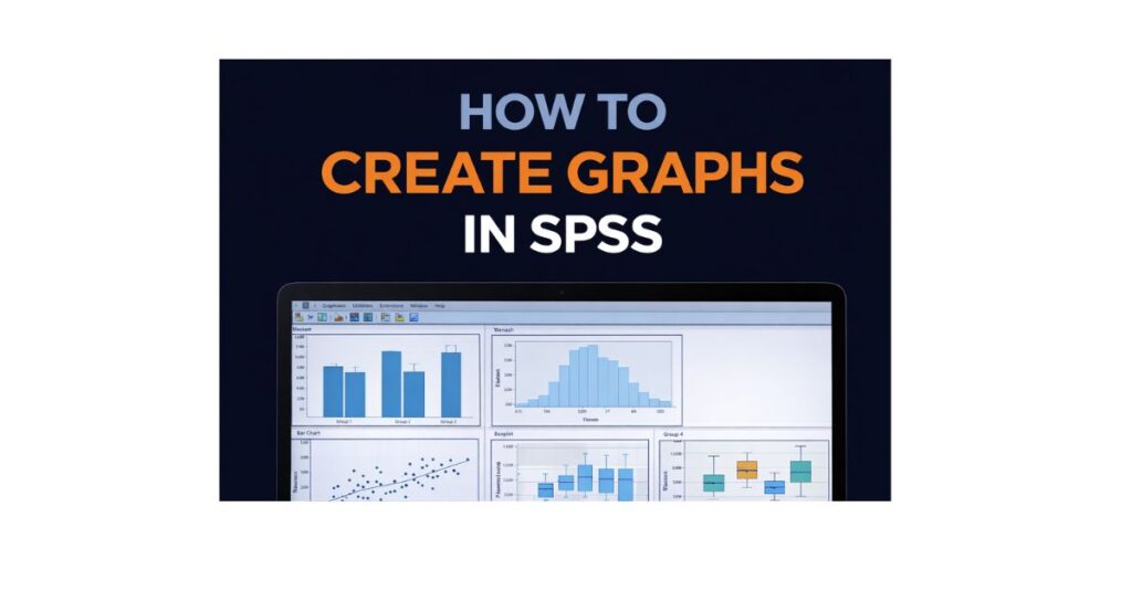
Most academic graphs in SPSS are created using Chart Builder.
- Click Graphs → Chart Builder
- If prompted, click OK to define measurement levels
Chart Builder provides flexibility and control, making it ideal for coursework and health research reporting.
Step 3: Select a Graph Template
In the Chart Builder window, browse the gallery on the left and choose the appropriate graph type. Drag the template into the preview area. SPSS will display placeholders for axes and grouping variables.
Step 4: Assign Variables to Axes
Assign variables by dragging them into the correct positions.
- Bar chart: categorical variable on X-axis, continuous variable on Y-axis
- Histogram: continuous variable on X-axis
- Boxplot: continuous variable on Y-axis, grouping variable on X-axis (optional)
- Scatterplot: one continuous variable on X-axis, another on Y-axis
- Line graph: time variable on X-axis, outcome variable on Y-axis
Correct placement is essential for accurate interpretation.
Step 5: Adjust Graph Properties
Before generating the graph, click Element Properties to select statistics such as means or counts and to add error bars if required. In health research, confidence intervals or standard deviations are often preferred for clarity.
Step 6: Create the Graph
Click OK to generate the graph. The output will appear in the Output Viewer.
Step 7: Edit the Graph for Academic Quality
Double-click the graph to open the Chart Editor. Edit titles, axis labels, font sizes, and scales. Remove unnecessary visual effects and ensure the graph is clear and readable.
Academic graphs should prioritize clarity over aesthetics.
Step 8: Export or Insert the Graph
Graphs can be copied directly into Word documents or exported as image files. Always follow your course or journal guidelines regarding format and resolution.
Creating Common Graphs in SPSS (Academic Focus)
Bar Charts for Group Comparisons
Bar charts are commonly used to compare group means, such as treatment conditions or demographic categories. In health research, bar charts often include error bars to show variability. Proper labeling and explanation are critical.
Histograms for Distribution Assessment
Histograms are used to assess whether data are approximately normally distributed. They are often required before conducting parametric tests such as t-tests or ANOVA.
Boxplots for Outliers
Boxplots highlight medians, quartiles, and outliers. In clinical and public health research, outliers may represent important cases that require explanation rather than removal.
Scatterplots for Relationships
Scatterplots visualize relationships between two continuous variables and are essential for correlation and regression analysis. Trend lines may be added to support interpretation.
APA Guidelines for Graphs Created in SPSS
APA style requires graphs to be numbered, titled clearly, and referenced in the text. Titles should describe what the figure shows, and axes must be labeled with units where appropriate. Graphs should support the written results, not replace them.
Students often struggle with APA formatting for figures. Reviewing How to Report SPSS Results in APA Format can help ensure consistency and correctness.
Common Mistakes When Creating Graphs in SPSS
Common mistakes include using the wrong graph type, failing to label axes, relying on default SPSS formatting, and including graphs without explanation. In health research, these errors can misrepresent findings and reduce academic credibility.
Avoiding these mistakes significantly improves the quality of assignments and research reports.
How Graphs Support Health and Academic Research
In health, nursing, psychology, and public health research, graphs are essential for communicating findings clearly to both academic and applied audiences. Clear visuals help readers understand patterns, trends, and differences quickly and accurately.
Mastering SPSS graph creation is not only about coursework but also about developing professional research skills.
When to Seek Help Creating SPSS Graphs
Some assignments require complex or highly specific graphs. In these cases, professional support can ensure accuracy and compliance with academic standards. Services such as SPSS Homework Help, SPSS Assignment Help, and Dissertation Data Analysis Help provide integrated support for analysis, graphs, and reporting.
Frequently Asked Questions
Which SPSS tool is best for graphs?
Chart Builder is recommended for most academic and health research graphs.
Are SPSS graphs acceptable for APA papers?
Yes, when properly formatted and labeled.
Do I need graphs for every analysis?
No. Graphs should be used when they add clarity or support interpretation.
Can SPSS graphs be edited after creation?
Yes. The Chart Editor allows extensive customization.
Final Thoughts
Learning how to create graphs in SPSS is a critical skill for academic and health research. Well-designed graphs strengthen analysis, improve clarity, and enhance the overall quality of research reports. By choosing the correct graph type, using SPSS tools properly, and following APA guidelines, students can create visuals that support strong, defensible conclusions.