
Understanding Scatter Plots and Regression Lines
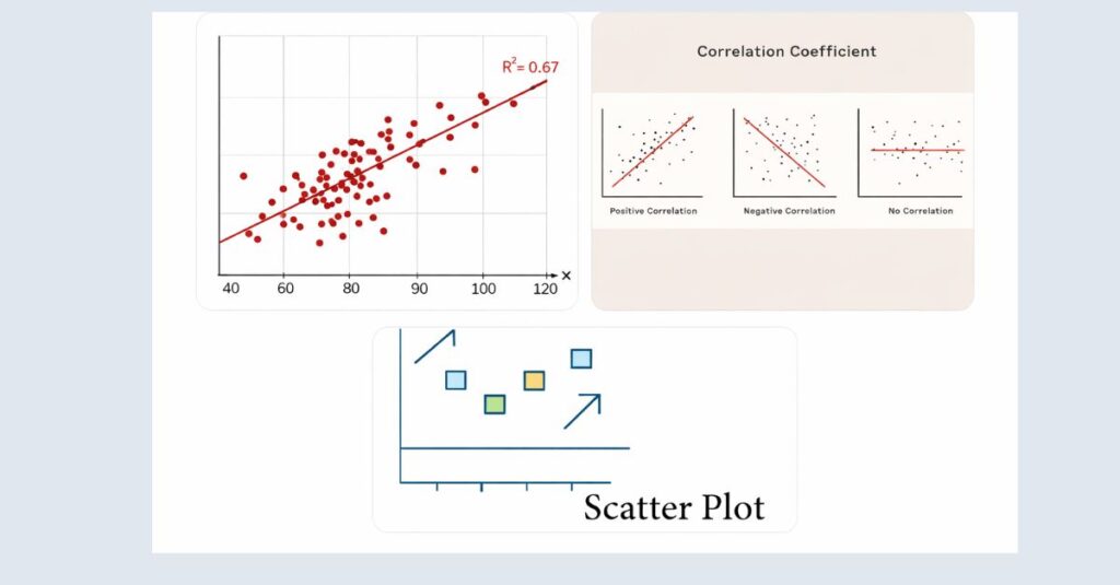
What Is a Scatter Plot?
Interpreting a scatter plot with a regression line is a core skill in statistical analysis and academic research. A scatter plot visually displays the relationship between two quantitative variables, while the regression line summarizes that relationship by showing the overall trend in the data. Learning to interpret scatter plot regression line patterns allows students and researchers to understand direction, strength, and consistency between variables before relying on numerical outputs.
Many statistical errors occur because researchers focus only on regression tables or correlation coefficients without first examining the visual relationship shown in the scatter plot. By carefully interpreting the placement of data points and the slope of the regression line, it becomes easier to identify meaningful patterns, outliers, and potential violations of regression assumptions. This guide explains how to interpret scatter plots with regression lines clearly and correctly, using academic examples suitable for assignments, theses, and research reports.
What Is a Regression Line?
A regression line, also known as a line of best fit, is a straight line drawn through a scatter plot that represents the predicted relationship between the independent and dependent variables. This line is calculated using statistical methods, most commonly ordinary least squares (OLS), which minimizes the total squared distance between the observed data points and the line itself.
The regression line helps transform a visual pattern into a mathematical relationship. It allows researchers to estimate how much the dependent variable is expected to change when the independent variable increases by one unit. When interpreting scatter plots, the regression line provides structure, direction, and strength to what might otherwise appear as a collection of scattered points.
Why Scatter Plots With Regression Lines Matter
Scatter plots with regression lines serve three critical purposes in data analysis:
- Exploratory analysis – They help identify whether a relationship exists at all.
- Model validation – They visually confirm whether linear regression is appropriate.
- Interpretation support – They make statistical results easier to explain in academic writing.
Many students make the mistake of jumping directly to correlation coefficients or regression outputs without visually inspecting the data. This often leads to misinterpretation, violated assumptions, or incorrect conclusions. Understanding how to interpret scatter plots with regression lines prevents these errors and strengthens the credibility of research findings.
Interpreting the Direction and Pattern of the Relationship
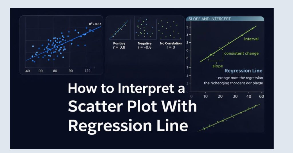
Positive, Negative, and No Relationship
The first step in interpreting a scatter plot with a regression line is identifying the direction of the relationship between variables.
A positive relationship occurs when increases in the independent variable are associated with increases in the dependent variable. On the scatter plot, this appears as points trending upward from left to right, with a regression line that slopes upward. For example, study time and exam scores often show a positive relationship.
A negative relationship occurs when increases in the independent variable are associated with decreases in the dependent variable. This appears as a downward trend, with the regression line sloping downward. An example might be stress levels and sleep duration.
A no relationship or weak relationship occurs when the points are randomly scattered with no clear pattern, and the regression line is nearly flat. In such cases, the independent variable does not meaningfully predict the dependent variable.
Linear vs Nonlinear Patterns
While regression lines assume linearity, not all relationships are linear. When interpreting a scatter plot, it is essential to assess whether the data points roughly follow a straight-line pattern or curve.
If the points form a curved shape (such as a U-shape or inverted U-shape), a simple linear regression line may be misleading. Even if a regression line is drawn, it may not accurately represent the true relationship. In academic research, this observation often leads to alternative models, such as polynomial regression or transformation of variables.
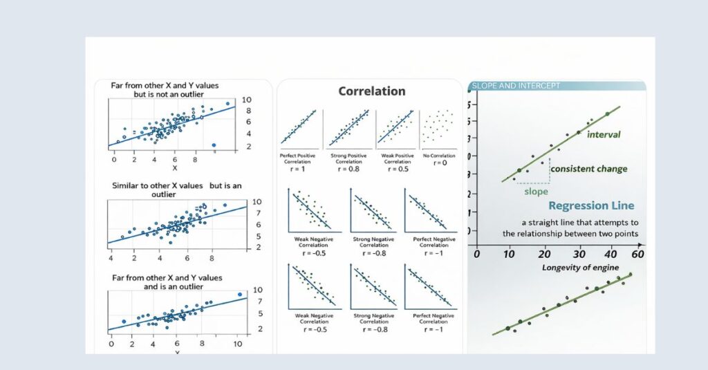
A linear pattern, even with some scatter, supports the use of linear regression and validates the interpretation of the regression line.
Clusters and Subgroups
Sometimes, scatter plots reveal clusters of data points rather than a single unified pattern. These clusters may represent different subgroups within the data, such as gender groups, age categories, or treatment conditions.
When clusters exist, the regression line may mask important subgroup differences. Interpreting such a plot requires caution, and researchers may need to run separate analyses or include grouping variables in their models. Recognizing clusters early helps prevent overgeneralized conclusions.
Evaluating the Strength of the Relationship
How Tight Are the Data Points?
The strength of a relationship is reflected in how closely the data points cluster around the regression line. When points lie very close to the line, the relationship is strong, and predictions based on the regression line are more reliable.
When points are widely scattered, the relationship is weak, even if the regression line slopes upward or downward. This distinction is critical because a statistically significant regression does not always imply a strong or meaningful relationship.
Visually assessing spread complements numerical measures such as the correlation coefficient (r) and the coefficient of determination (R²).
Interpreting the Regression Line Slope
The slope of the regression line indicates the direction and magnitude of the relationship. A steep slope suggests that small changes in the independent variable lead to large changes in the dependent variable. A shallow slope indicates a weaker effect.
For example, if the regression line shows that exam scores increase by 5 points for every additional hour of study, this slope has a clear and interpretable meaning. In contrast, a slope of 0.2 may be statistically significant but practically negligible.
Understanding slope in the context of the scatter plot prevents students from overstating findings in dissertations or research papers.
Outliers and Their Impact
Outliers are data points that fall far from the general pattern of the data. In scatter plots, outliers can dramatically influence the position and slope of the regression line.
A single extreme outlier may create the illusion of a relationship that does not exist or weaken a relationship that is otherwise strong. When interpreting scatter plots, researchers must identify outliers and determine whether they represent valid observations, measurement errors, or unique cases.
Academic best practice requires reporting how outliers were handled and justifying any exclusions.
Using Scatter Plots With Regression Lines in Academic Writing
Linking Visual Interpretation to Statistical Results
Scatter plots should never be interpreted in isolation. Instead, they should be used alongside regression output, correlation coefficients, and significance tests.
A well-written interpretation typically follows this structure:
- Describe the visual pattern observed in the scatter plot
- Reference the direction and strength of the regression line
- Support the visual interpretation with numerical statistics
For example, a researcher might write that the scatter plot shows a moderate positive linear relationship, which is consistent with a statistically significant regression coefficient.
Common Interpretation Mistakes to Avoid
One of the most common mistakes is assuming causation from correlation. A regression line shows association, not cause-and-effect. Even a strong linear relationship does not prove that changes in one variable cause changes in another.
Another mistake is ignoring assumption violations. Scatter plots often reveal heteroscedasticity, nonlinearity, or influential outliers. Ignoring these visual warnings can invalidate regression results.
Students also frequently overinterpret weak relationships, especially when p-values are significant due to large sample sizes. Visual interpretation helps maintain balance and realism in conclusions.
Example of a Proper Interpretation
Consider a scatter plot showing hours of study on the x-axis and exam scores on the y-axis, with an upward-sloping regression line. The points cluster moderately close to the line, with no extreme outliers.
A strong interpretation would explain that the plot suggests a positive linear relationship, meaning students who study more tend to achieve higher scores. It would note the moderate spread of points, indicating some variability, and conclude that while study time is a meaningful predictor, other factors likely also influence exam performance.
This type of interpretation demonstrates statistical literacy and aligns with academic standards.
Practical Tips for Students Using SPSS and Similar Tools
Why Visual Inspection Comes First
In statistical software such as SPSS, scatter plots are often generated before regression analysis. This step is not optional. Visual inspection helps confirm whether linear regression is appropriate and whether transformations or alternative models are needed.
Skipping this step increases the risk of incorrect test selection and weak academic arguments.
Reporting Scatter Plots in Assignments and Theses
When including scatter plots in academic work, they should be clearly labeled, properly scaled, and accompanied by a concise interpretation in the text. The regression line should be included when appropriate, and axes should reflect meaningful variable names rather than raw dataset labels.
Students should also reference the figure in the narrative and explain what it reveals about the research question.
When to Seek Expert Support
Interpreting scatter plots with regression lines becomes more complex when dealing with large datasets, multiple predictors, or assumption violations. In such cases, expert guidance helps ensure accurate interpretation and defensible conclusions.
Understanding the visual relationship is the foundation of sound statistical analysis, and mastering this skill significantly improves the quality of academic research.
Final Thoughts
Learning how to interpret a scatter plot with a regression line is not just a technical skill; it is a critical part of statistical reasoning. Scatter plots bridge the gap between raw data and mathematical models, allowing researchers to see patterns, detect problems, and communicate findings clearly.
By carefully examining direction, strength, spread, and outliers, students and researchers can avoid common errors and produce analyses that are both statistically valid and academically persuasive. When combined with proper regression output and thoughtful interpretation, scatter plots become one of the most powerful tools in quantitative research.