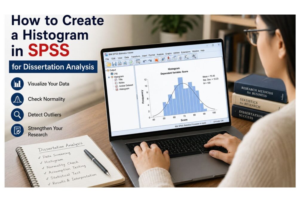
Knowing how to create a histogram in SPSS is an important skill for students, researchers, and dissertation writers who need to understand the distribution of their data before running statistical tests. A histogram helps you see whether a continuous variable is approximately normal, skewed, affected by outliers, or unsuitable for certain types of analysis. This is especially important in dissertation research because many statistical tests require you to examine your data before making final decisions about your analysis.
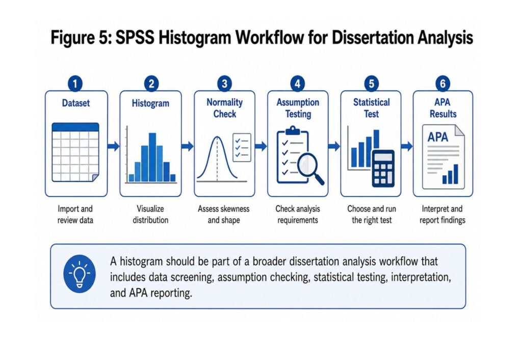
For dissertation students, a histogram is not just a simple graph. It is part of the data screening and assumption-checking process. Before running t-tests, ANOVA, correlation, regression, or other statistical analyses, you often need to examine whether your continuous variables are distributed in a way that supports the planned test. A histogram gives you a visual way to check the shape of the data and decide whether further tests, transformations, or assumption checks are needed.
This guide explains how to create a histogram in SPSS using the menu, how to add a normal curve, how to use SPSS syntax, how to interpret the histogram output, and how to report histogram findings in a dissertation or thesis. If you are unsure whether your histogram supports your planned analysis, SPSS Dissertation Help can review your dataset, SPSS output, research questions, and university requirements. Request a free quote today for expert SPSS support.
Expert Review
This guide is written for undergraduate, master’s, and PhD students using SPSS for dissertation, thesis, capstone, or academic research projects. It explains both the software steps and the statistical interpretation needed for responsible academic reporting, so students do not simply create the graph but also understand what the graph means for their research results.
All datasets, research questions, and dissertation materials shared with SPSSDissertationHelp.com are handled confidentially and used only to support the requested analysis. Whether you need help creating histograms, checking normality, interpreting output, or writing Chapter 4 results, our goal is to provide clear and accurate SPSS support.
What Is a Histogram in SPSS?
A histogram in SPSS is a graph that displays the distribution of a continuous numeric variable. It groups values into intervals and shows how many cases fall within each interval. For example, if your dataset includes the ages of 250 participants, a histogram can show whether most participants are younger, middle-aged, older, or spread evenly across the age range. If your dataset includes exam scores, a histogram can show whether most students scored near the middle, whether scores are skewed high or low, or whether some scores appear unusually extreme.
A histogram usually includes an x-axis showing the values or value ranges of the variable, a y-axis showing the frequency or number of cases, bars representing how many observations fall within each range, and an optional normal curve that helps you visually compare the data to a normal distribution. This makes histograms especially useful during early data analysis because they give you a quick visual understanding of the variable before you run statistical tests.
A histogram can help you answer important research questions such as whether your variable is approximately normally distributed, whether the distribution is positively or negatively skewed, whether there are possible outliers, whether values are clustered in one section of the scale, whether the variable is suitable for parametric testing, and whether you need to investigate missing values or unusual codes. This makes histograms an important part of SPSS data analysis help, especially for students working on dissertation or thesis research.
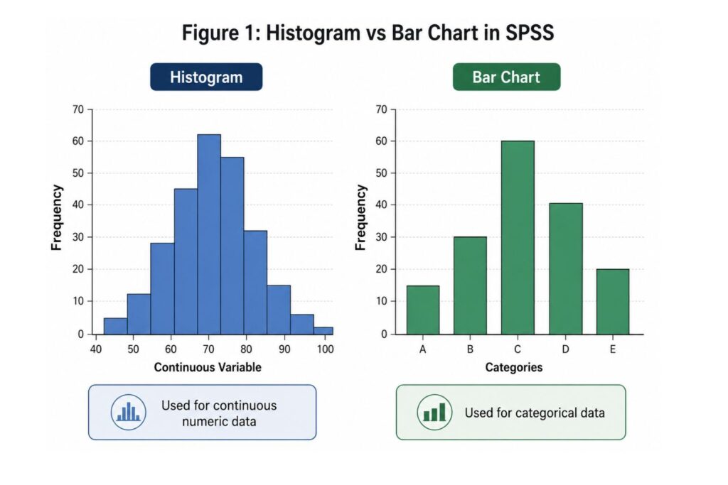
Histogram vs Bar Chart in SPSS
Students often confuse histograms with bar charts because both use vertical bars. However, they are not the same. A histogram is used for continuous numerical data, while a bar chart is used for categorical data. This difference matters because choosing the wrong graph can make your data presentation confusing or statistically inappropriate, especially in a dissertation results chapter where each figure should support the research question clearly.
| Feature | Histogram | Bar Chart |
|---|---|---|
| Best for | Continuous numeric variables | Categorical variables |
| Example variables | Age, income, exam score, satisfaction score | Gender, education level, department, job role |
| Main purpose | Shows the shape of a distribution | Compares categories |
| Bars | Usually touch each other | Usually separated |
| Dissertation use | Data screening, normality checks, outlier detection | Frequency comparisons and group summaries |
Use a histogram when your variable is continuous or scale-level, such as age, income, test score, reaction time, satisfaction score, anxiety score, number of hours studied, customer rating scale, or a composite survey score. Use a bar chart when your variable is categorical, such as gender, marital status, education level, treatment group, employment status, department, or type of organization. For dissertation work, this distinction is important because histograms are usually used in assumption checking, while bar charts are usually used to summarize participant characteristics or categorical responses.
When Should You Use a Histogram in SPSS?
You should use a histogram in SPSS when you need to visually examine the distribution of a continuous variable. This is usually done before running more advanced analyses because the histogram helps you understand how your values are spread across the scale. It can show whether most scores are grouped around the center, whether the data are stretched to the right or left, or whether a small number of extreme values may affect your statistical results.
Histograms are commonly used during preliminary data screening. This stage helps you understand your data before you test hypotheses or answer research questions. You should create a histogram when you want to check whether a variable is approximately normally distributed, identify positive or negative skewness, detect possible outliers, understand the spread of scores, review scale scores before hypothesis testing, or check assumptions before t-tests, ANOVA, correlation, or regression.
A histogram does not prove normality by itself. It gives a visual impression of the distribution. For stronger assumption checking, you should combine histograms with other methods, including descriptive statistics, skewness and kurtosis values, Q-Q plots, boxplots, and normality tests such as Shapiro-Wilk or Kolmogorov-Smirnov. If you are unsure which assumption checks your dissertation requires, our dissertation data analysis help service can guide you through the correct process.
How to Create a Histogram in SPSS Using the Menu
The easiest way to create a histogram in SPSS is through the Graphs menu. This is the best method for beginners because it does not require SPSS syntax. It is also useful when you only need to create one or two histograms for a dissertation, class assignment, research report, or preliminary data screening task.
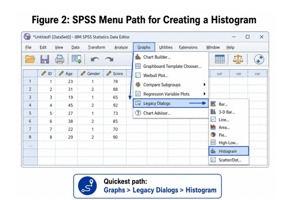
To create a histogram in SPSS, open your dataset, click Graphs in the top menu, select Legacy Dialogs, and then click Histogram. In the Histogram dialog box, choose the continuous variable you want to graph and move it into the Variable box. If you want SPSS to place a normal distribution curve over the bars, tick Display normal curve. You can also click Titles if you want to add a title, subtitle, or footnote. After selecting your options, click OK, and the histogram will appear in the SPSS Output Viewer.
The quick SPSS menu path is: Graphs → Legacy Dialogs → Histogram → Select Variable → Display Normal Curve → OK. This method is helpful when you are learning SPSS for the first time because it allows you to create the graph without writing commands. However, if your dissertation includes several continuous variables, SPSS syntax may be faster because you can create multiple histograms at once.
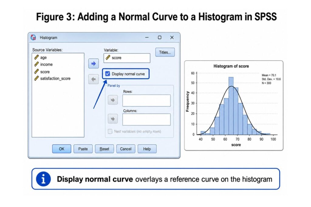
How to Add a Normal Curve to a Histogram in SPSS
A normal curve is a smooth bell-shaped curve that SPSS can place over your histogram. It helps you compare your actual data to a normal distribution. This is useful because many dissertation analyses require students to check whether a continuous variable appears approximately normal before selecting or interpreting a statistical test.
To add a normal curve, click Graphs, select Legacy Dialogs, click Histogram, move your continuous variable into the Variable box, tick Display normal curve, and then click OK. SPSS will create a histogram with a normal curve over the bars. If the bars roughly follow the shape of the curve, the variable may be reasonably normal. If the bars are pushed strongly to one side or the tail is long, the variable may be skewed.
However, you should not expect a perfect match between your data and the normal curve. Real dissertation data rarely look perfectly normal. Small samples may look uneven because there are not enough cases, while large samples may reveal small deviations that are visually noticeable but not always serious. For stronger interpretation, combine the histogram with Q-Q plots, boxplots, skewness and kurtosis, Shapiro-Wilk or Kolmogorov-Smirnov tests, and a review of missing values or possible outliers.
How to Create a Histogram in SPSS Using Syntax
SPSS syntax is another way to create histograms. Syntax is useful because it saves your analysis steps and makes your work easier to repeat. This is helpful for dissertation students because it creates a record of your analysis process. If your supervisor, committee member, or statistician asks how a graph was created, you can show the exact command instead of trying to remember every menu option you selected.
SPSS Syntax for a Histogram With Normal Curve
FREQUENCIES VARIABLES=age
  /FORMAT=NOTABLE
  /HISTOGRAM NORMAL.
In this example, age is the variable being graphed. To use this syntax for your own dataset, replace age with your variable name. For example, if your variable is called satisfaction_score, the syntax would be:
FREQUENCIES VARIABLES=satisfaction_score
  /FORMAT=NOTABLE
  /HISTOGRAM NORMAL.
The line FREQUENCIES VARIABLES=age tells SPSS which variable to analyze. The command /FORMAT=NOTABLE prevents SPSS from producing a long frequency table, which keeps the output cleaner. The command /HISTOGRAM NORMAL tells SPSS to create a histogram with a normal curve. Syntax is not required for beginners, but it is valuable when you want reproducible and professional SPSS work.
You can also create a simple histogram using the GRAPH command:
GRAPH
  /HISTOGRAM=age
  /TITLE='Histogram of Age'.
This command creates a histogram for the variable age and adds a custom title. If you need help writing, checking, or explaining SPSS syntax, visit our SPSS statistics help page.
How to Create Multiple Histograms in SPSS
If your dissertation includes several continuous variables, creating histograms one at a time can take too long. SPSS syntax allows you to create multiple histograms more efficiently. This is especially useful when you are screening several survey scales, questionnaire subscales, test scores, health measures, business performance indicators, or experimental outcome variables before selecting your final statistical tests.
Example:
FREQUENCIES VARIABLES=age income test_score satisfaction_score
  /FORMAT=NOTABLE
  /HISTOGRAM NORMAL.
This command creates separate histograms for age, income, test score, and satisfaction score. For dissertation students, multiple histograms help identify which variables may need additional checking before choosing the correct statistical test. For example, if you have five dependent variables and three predictor variables, you may create histograms for all continuous variables before running regression or multivariate analysis. This helps you identify skewness, outliers, or unusual distributions early.
If you are working with several variables and do not know which tests or assumption checks are required, you can hire a data analysis expert to review your dataset and guide the correct next steps.
How to Customize a Histogram in SPSS
After creating a histogram, you may want to customize it before adding it to your dissertation or report. In SPSS, you can usually double-click the histogram in the Output Viewer to open the Chart Editor. From there, you can adjust the appearance of the graph so that it is clearer, easier to read, and more suitable for academic presentation.
Common histogram edits include changing the chart title, editing axis labels, adjusting font size, changing number formatting, editing the scale, removing unnecessary chart elements, and improving readability for dissertation presentation. For academic writing, your histogram should be clear, simple, and easy to understand. Avoid unnecessary colors, 3D effects, or decorative formatting because your goal is not to make the graph look flashy. Your goal is to communicate the distribution clearly.
A strong dissertation histogram should include a clear title, a properly labeled x-axis, a properly labeled y-axis, readable numbers, a clean layout, and no distracting design elements. If you are exporting your histogram into Word, make sure the image quality is high enough for your university’s formatting requirements. You may also need to follow APA 7 figure formatting if your institution requires APA style.
How to Interpret a Histogram in SPSS
Creating a histogram is only the first step. The most important part is knowing what the histogram means. When interpreting an SPSS histogram, look at the shape, center, spread, skewness, outliers, gaps, and possible multiple peaks. These features help you decide whether the data look normal, skewed, unusual, or affected by subgroups
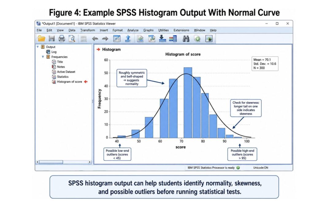
Approximately Normal Distribution
A histogram is approximately normal when it has a bell-shaped pattern. Most values appear near the center, while fewer values appear at the lower and higher ends. A distribution may be considered approximately normal when the bars are roughly centered, the left and right sides are reasonably balanced, the distribution follows the general shape of the normal curve, there are no severe outliers, and the mean and median are relatively close.
The histogram does not need to be perfect. In real dissertation data, some minor irregularity is normal. What matters is whether the pattern is acceptable for the analysis you plan to run and whether any visible problems are serious enough to affect your results.
Positively Skewed Distribution
A positively skewed histogram has a long tail to the right. This means most values are lower, but a smaller number of cases have much higher values. Variables that may be positively skewed include income, time spent on a task, number of absences, medical costs, sales revenue, website visits, and number of customer complaints.
If a variable is strongly positively skewed, you may need to check for outliers, consider transformation, or use a nonparametric test. In dissertation work, you should not ignore a strongly skewed histogram because skewness can affect the interpretation of some statistical procedures.
Negatively Skewed Distribution
A negatively skewed histogram has a long tail to the left. This means many values are high, while fewer values are low. This can happen with easy test scores, satisfaction ratings, agreement scales, performance scores, or positive attitude scales.
A negatively skewed variable may suggest a ceiling effect, especially when many participants select the highest possible score. If your dissertation data show this pattern, you may need to explain whether the distribution reflects the nature of the sample, the measurement scale, or the wording of the survey items.
Outliers
Outliers are values that appear far away from the rest of the data. In a histogram, outliers may appear as isolated bars at the far left or far right. Outliers may be caused by data-entry errors, measurement errors, unusual but valid observations, incorrect coding, or missing value codes entered as real values.
For example, if age is coded as 999 for missing data, the histogram may show an extreme bar far away from the other values. This should be corrected before analysis. Before removing any value, however, you should check whether the value is truly an error or a valid observation.
Gaps or Multiple Peaks
If your histogram has gaps, clusters, or more than one peak, this may suggest that your data include different subgroups. For example, a test score histogram may show two peaks if one group received training and another group did not. In this case, you may need to examine the variable by group or use split-file analysis.
A histogram with multiple peaks does not automatically mean your data are wrong. It may simply mean that the sample contains meaningful groups. The key is to investigate the pattern before running final statistical tests.
Table: How to Read SPSS Histogram Shapes
| Histogram Shape | Meaning | What to Check Next |
|---|---|---|
| Bell-shaped | Approximate normality | Descriptives, Q-Q plot, normality test |
| Right-skewed | High-value tail | Outliers, transformation, nonparametric test |
| Left-skewed | Low-value tail | Ceiling effect, scale design |
| Two peaks | Possible subgroups | Grouping variable or split-file analysis |
| Extreme bars | Possible outliers | Data cleaning and case inspection |
| Flat distribution | Values are widely spread | Measurement scale and sample characteristics |
How to Report a Histogram in a Dissertation
In most dissertations, you do not need to write a long explanation for every histogram. Histograms are usually reported as part of preliminary data screening, descriptive analysis, or assumption checking. Your goal is to explain what the histogram shows and why it matters for your analysis, not simply to say that a chart was created in SPSS.
For an approximately normal distribution, you might write: “The histogram for age suggested that the distribution was approximately normal, with most observations clustered near the center of the distribution and no severe outliers visible.” For a positively skewed distribution, you might write: “The histogram for income showed a positive skew, indicating that most respondents reported lower-to-moderate income values, while a smaller number reported substantially higher values.”
If possible outliers are present, you might write: “Visual inspection of the histogram suggested the presence of possible outliers. These values were reviewed before conducting the final statistical analysis.” If you are discussing assumption checking more generally, you might write: “Histograms were used as part of the preliminary screening process to assess the distribution of continuous variables before conducting inferential analyses.”
APA-style reporting usually focuses on the interpretation of the graph rather than the software action. Instead of writing, “A histogram was created in SPSS,” write, “Visual inspection of the histogram indicated that satisfaction scores were approximately normally distributed, supporting the use of parametric analysis.” If you need help writing your results chapter, visit our dissertation results help page.
Common SPSS Histogram Problems and Fixes
Students often experience problems when creating histograms in SPSS. Most problems can be fixed by checking the variable type, missing values, output viewer, or graph settings. Before running your final analysis, always check whether the problem is caused by the data itself or by the way SPSS is reading the variable.
| Problem | Possible Cause | Fix |
|---|---|---|
| Variable does not appear in the list | Variable is string/text | Recode or convert it to numeric |
| Histogram looks empty | Missing data or wrong variable selected | Check valid cases and variable coding |
| Normal curve option missing | Wrong chart tool selected | Use Graphs > Legacy Dialogs > Histogram |
| Bars look strange | Too few cases or extreme values | Check sample size and outliers |
| Output not showing | Output Viewer minimized or closed | Open the SPSS Output Viewer |
| Histogram is not suitable | Variable is categorical | Use a bar chart instead |
| One bar appears far away | Missing value code entered as data | Define missing values correctly |
| Distribution looks non-normal | Skewness or outliers may be present | Check Q-Q plot, descriptives, and assumptions |
SPSS Histogram Help for Dissertation Students
Creating a histogram in SPSS is simple. Interpreting it correctly is often the harder part. Many students can produce the graph but still feel unsure about what it means for their dissertation analysis. This is where expert support becomes helpful because the issue is not only how to create the histogram but also how to connect it to normality, assumptions, test selection, and results reporting.
Common questions include whether the histogram shows normality, whether the variable is too skewed, whether there are outliers, whether transformation is needed, whether regression or ANOVA can still be used, whether the histogram should be reported in Chapter 4, and how the result should be explained in APA style. These questions matter because a poorly interpreted histogram can lead to weak analysis decisions or unclear dissertation writing.
At SPSSDissertationHelp.com, we support students with more than simple software instructions. We help you connect your SPSS output to your research questions, methodology, results chapter, and supervisor expectations. Our support includes data cleaning, variable coding, descriptive statistics, histograms and normality checks, SPSS syntax, assumption testing, test selection, APA 7 results reporting, Chapter 4 results writing, and supervisor revision support.
If your histogram is part of a larger dissertation analysis, you can also review our page on pay someone to do my dissertation statistics for structured and ethical academic statistics support.
Need help checking whether your SPSS histogram supports your planned analysis? Request a free quote today and let our SPSS experts review your dataset, research questions, and output.
Pricing and Support Options
The cost of SPSS histogram help or dissertation data analysis support depends on the actual requirements of your project. A simple descriptive statistics task is different from a full dissertation analysis involving normality checks, reliability analysis, t-tests, ANOVA, regression, mediation, moderation, APA tables, interpretation, and Chapter 4 writing.
Pricing may depend on your academic level, deadline, number of variables, dataset condition, complexity of analysis, type of statistical tests required, whether interpretation is needed, whether APA tables and figures are required, whether Chapter 4 writing is included, and whether revision support is required. This is why SPSSDissertationHelp.com provides personalized quotes based on your project details instead of using one fixed price for every student.
This approach allows you to receive pricing that reflects the actual work required. If you only need help creating and interpreting histograms, your quote will be different from a student who needs a complete dissertation data analysis package. For more information, visit our SPSS help pricing page.
Why Students Trust SPSSDissertationHelp.com
Students choose SPSSDissertationHelp.com because dissertation statistics require accuracy, confidentiality, and clear academic explanation. Our service is designed for students who need expert support with SPSS analysis, interpretation, assumption checking, and results reporting.
Students trust us because we provide confidential academic support, expert SPSS data analysis, dissertation-focused interpretation, APA-ready reporting, clear communication, personalized pricing, and support for undergraduate, master’s, and PhD students. We also help students respond to supervisor comments and revisions, which is important when the first draft of the analysis needs improvement.
We do not simply create graphs and leave you confused. We help you understand what your SPSS output means and how it connects to your research questions. You can also learn more about our reviews, our writers, and how it works.
Share your dataset, research questions, and university requirements today. We will review your project and recommend the right SPSS analysis support.
FAQs About Creating Histograms in SPSS
To create a histogram in SPSS, click Graphs, select Legacy Dialogs, choose Histogram, move your continuous variable into the Variable box, optionally tick Display normal curve, and click OK. The histogram will appear in the SPSS Output Viewer.
A histogram should be used for a continuous numeric variable. Examples include age, income, test score, satisfaction score, reaction time, and other scale-level variables. For categorical variables, use a bar chart instead.
Yes, you can add a normal curve when you want to visually compare your data to a normal distribution. This is useful during assumption checking, but it should not be the only evidence used to determine normality.
Yes. You can create a histogram in SPSS using syntax. For example:
FREQUENCIES VARIABLES=age
/FORMAT=NOTABLE
/HISTOGRAM NORMAL.
Replace age with your own variable name.
To interpret a histogram in SPSS, examine the shape, center, spread, skewness, and possible outliers. A bell-shaped histogram suggests approximate normality, while a long tail may suggest skewness.
A skewed histogram means the data are not evenly distributed around the center. A right-skewed histogram has a long tail to the right, while a left-skewed histogram has a long tail to the left. Skewness may affect the choice of statistical test.
No. A histogram is a visual tool and should not be used alone to prove normality. It should be combined with Q-Q plots, skewness and kurtosis, descriptive statistics, and formal normality tests where appropriate.
In a dissertation, report what the histogram shows rather than simply saying it was created. For example: “Visual inspection of the histogram suggested that the distribution was approximately normal, with no severe outliers visible.”
Yes. SPSSDissertationHelp.com can help you interpret histograms, check normality, identify outliers, choose the correct statistical test, and write APA-style results for your dissertation or thesis.
The cost depends on your academic level, deadline, dataset, number of variables, analysis complexity, and whether you need interpretation or Chapter 4 writing. You can request a personalized quote through our pricing page.
Conclusion
Knowing how to create a histogram in SPSS is an important skill for students and researchers who need to understand their data before running statistical tests. The easiest method is Graphs → Legacy Dialogs → Histogram, but you can also create histograms using SPSS syntax, especially when working with multiple variables or documenting your analysis process for a dissertation.
However, creating the histogram is only the beginning. The real value comes from interpreting the distribution, identifying skewness or outliers, and deciding whether your data meet the assumptions required for your planned statistical tests. A histogram can help you make better decisions before running t-tests, ANOVA, correlation, regression, or other statistical procedures.
If you are unsure whether your histogram supports your analysis, SPSSDissertationHelp.com can help. Request a free quote today and get expert support with SPSS histograms, normality checks, data analysis, APA reporting, and dissertation results writing.