
To create a 3D bar chart in Excel, select your dataset, go to Insert, choose Insert Column or Bar Chart, pick a 3-D Bar option, and then customize the chart using Chart Design and Format. The whole process takes less than two minutes once your data is organized correctly.
A 3D bar chart adds depth to a standard bar chart so that bars appear to sit on a floor with visual perspective, rather than as flat rectangles. It is useful for presentations, classroom assignments, and simple descriptive comparisons where visual style matters as much as precision. Microsoft Excel can build several 3D variations, including 3-D Clustered Bar, 3-D Stacked Bar, and 3-D 100% Stacked Bar, plus the closely related 3-D Column chart. This guide walks through how to create a 3D bar chart in Excel from a blank worksheet, how to customize titles, labels, rotation, and colors, and how clustered and stacked layouts differ. It also covers when a 3D chart helps and when a flat 2D chart is the better choice for academic reporting, and how Excel charts compare with SPSS charts for dissertation and research work.
What Is a 3D Bar Chart in Excel?
A bar chart represents categorical data (such as survey methods, departments, or age groups) plotted against a quantitative data value, such as counts, percentages, or means. Each category becomes one bar, and the bar’s length or height shows its value.
Applying 3D formatting adds a sense of depth and perspective to those bars. Instead of a flat rectangle, each bar appears as a three-dimensional block with visible width, height, and depth, sitting on a shaded floor with a back wall. Excel uses two related but distinct labels for this style of chart:
- Bar chart: bars extend horizontally, and categories are listed down the left side.
- Column chart: bars extend vertically, and categories are listed along the bottom.
Both can be rendered in 3D, and both are commonly used in business presentations, classroom projects, and descriptive research summaries. The trade-off is that 3D formatting can make it harder to judge exact values, because perspective and depth compress or exaggerate how bars appear relative to the gridlines. That does not make 3D charts unusable; it simply means labels, data values, and careful rotation matter more than in a flat 2D chart.
3D Bar Chart vs 3D Column Chart
Many people who search for how to make a 3D bar graph in Excel are actually picturing vertical columns, since “bar graph” is often used informally to describe any bar-style chart. Excel, however, treats these as two separate chart families.
3D Bar Chart
- Bars extend horizontally, from left to right.
- Categories are listed on the vertical axis.
- Useful when category labels are long, since horizontal bars leave more room for text.
3D Column Chart
- Columns extend vertically, from bottom to top.
- Categories are listed on the horizontal axis.
- More common in business dashboards and slide presentations because it mirrors how most people expect a bar-style chart to look.
If your goal is the vertical version most tutorials picture, look under Insert Column or Bar Chart and choose one of the 3-D Column options instead of 3-D Bar. The steps below apply to both families; only the chart subtype selected in Step 5 changes.
Sample Dataset
The tutorial below uses a small research dataset that reflects how students often organize survey or methodology data for a dissertation or class project:
| Research Method | Number of Students |
|---|---|
| Surveys | 45 |
| Interviews | 32 |
| Experiments | 28 |
| Observation | 20 |
| Focus Groups | 25 |
In Excel, this should be entered as two plain columns: category labels in column A and numeric values in column B, with headers in row 1. Avoid merged cells, blank rows, or extra formatting in the data range. Excel’s chart tool reads the structure of the table directly, and irregular layouts are one of the most common reasons a 3D chart option appears greyed out or produces an unexpected result.
How to Create a 3D Bar Chart in Excel
Step 1: Enter the Data
Type your category labels into one column (for example, Research Method in A1:A6) and the corresponding numeric values into the column beside it (Number of Students in B1:B6). Keep one variable per column and one case per row.
Step 2: Select the Data
Highlight the full range, including both header cells: A1:B6. Selecting the headers allows Excel to automatically use them as the chart title suggestion and the legend or axis label text.
Step 3: Open the Insert Tab
Click the Insert tab on the Excel ribbon. This tab contains every chart type Excel supports, grouped into small icon menus.
Step 4: Choose Insert Column or Bar Chart
In the Charts group, click the icon labeled Insert Column or Bar Chart (it looks like a small set of vertical bars). This opens a dropdown gallery split into 2-D and 3-D sections.
Step 5: Select a 3-D Bar Chart
Under the 3-D Bar section, choose from:
- 3-D Clustered Bar: compares two or more series side by side within each category.
- 3-D Stacked Bar: stacks multiple series on top of each other to show a total.
- 3-D 100% Stacked Bar: stacks series as proportions that always sum to 100%.
For a single data series like the sample table above, Excel will typically only need the basic 3-D Bar option, since clustering and stacking apply once a second data series is added. If you want vertical bars instead, the equivalent choices sit in the 3-D Column section directly above.
Step 6: Insert the Chart
Click the chart subtype to insert it. Excel automatically creates a chart object on the worksheet using the selected range, applies default colors, and generates a temporary chart title based on your data.
Step 7: Edit the Chart Title
Double-click the default chart title text box and replace it with something specific, such as Research Methods Used by Students. A descriptive title should tell the reader what is being compared and, if relevant, the unit of measurement.
Step 8: Add Axis Titles
Click the chart, then open Chart Design > Add Chart Element > Axis Titles (in newer versions of Microsoft 365 this may also appear as a small + icon labeled Chart Elements beside the chart). Label the value axis clearly, for example Number of Students, so the reader does not have to guess what the numbers represent.
Step 9: Add Data Labels
Open Chart Elements > Data Labels and choose a position such as Outside End or Inside End. This displays the actual numeric value on or near each bar, which is especially useful on 3D charts where perspective can make bar length harder to judge precisely.
Step 10: Customize the Chart
Right-click any part of the chart to access Format Chart Area, Format Data Series, or Format Axis. From here you can adjust fill colors, gap width between bars, gridline visibility, font size, and the 3D rotation and perspective settings covered in the next section.
Menu wording can differ slightly between Excel for Microsoft 365, Excel 2021/2024, and Excel for Mac. The ribbon layout described above reflects Excel for Microsoft 365; older desktop versions may label the same options slightly differently, and Excel for Mac sometimes places chart formatting under a separate Chart Design and Format tab pair rather than a single combined ribbon.
GRAPH 1: Basic 3D Bar Chart
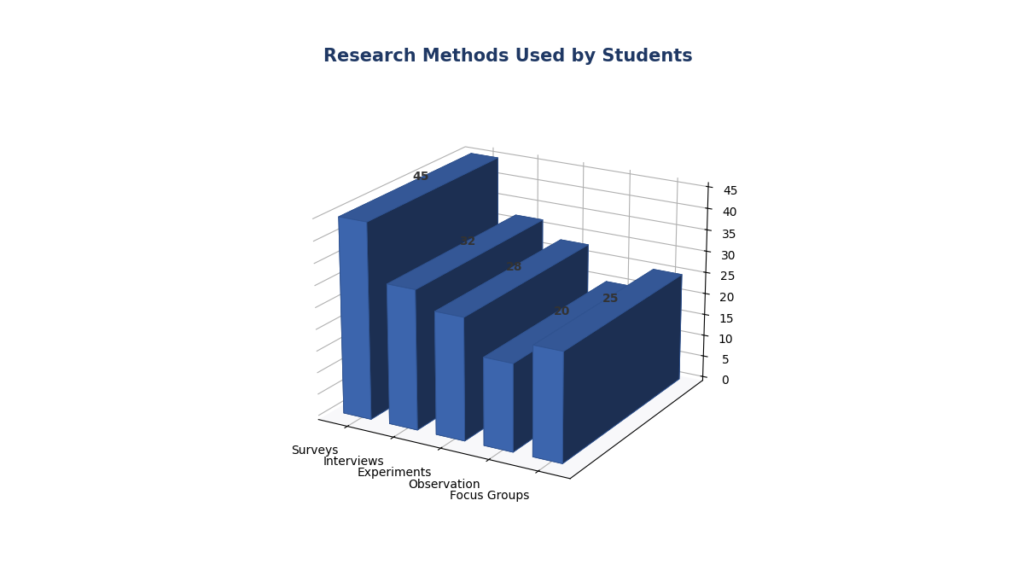
This chart compares the number of students using surveys, interviews, experiments, observation, and focus groups, and illustrates exactly how the steps above render in practice once a chart title, axis label, and data labels are applied.
How to Create a 3D Clustered Bar Chart in Excel
A clustered chart becomes useful once you need to compare two or more groups within the same category, for example when comparing undergraduate and postgraduate students across the same set of research methods rather than looking at one combined total.
| Research Method | Undergraduate | Postgraduate |
|---|---|---|
| Surveys | 45 | 38 |
| Interviews | 25 | 40 |
| Experiments | 35 | 30 |
| Observation | 20 | 27 |
To build this chart:
- Enter the data with Research Method in column A and one column for each student group (Undergraduate, Postgraduate).
- Select the full range, A1:C5, including headers.
- Go to Insert > Insert Column or Bar Chart.
- Choose 3-D Clustered Bar from the 3-D Bar section.
- Excel automatically places one bar per group side by side within each category, and adds a legend distinguishing the two series.
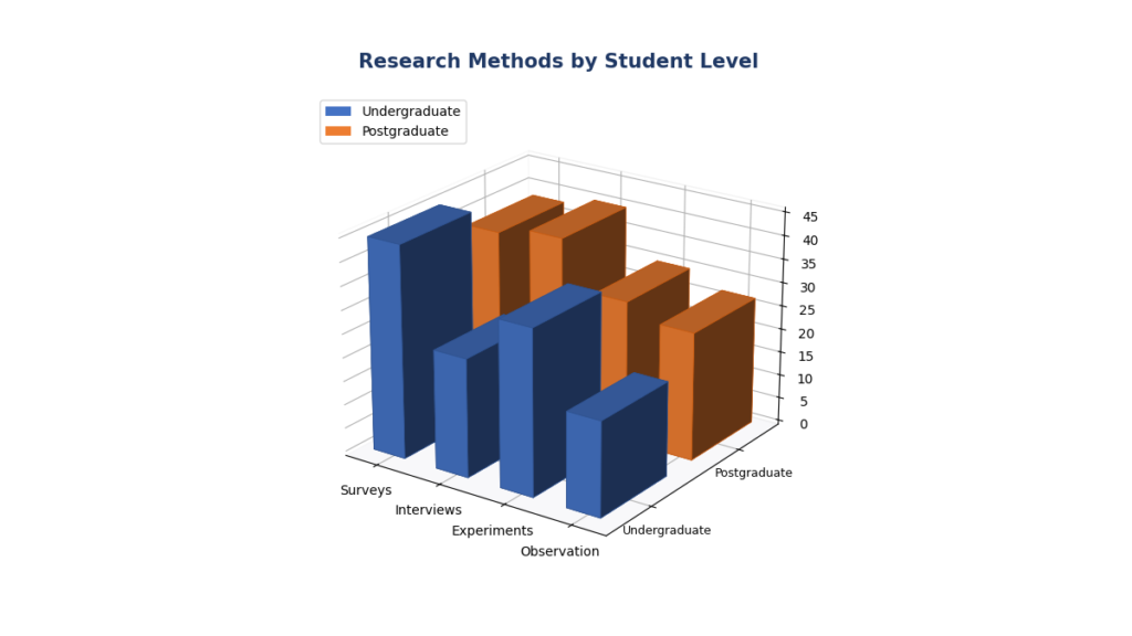
Because each category now shows two adjacent bars, a clustered chart makes it easy to see, for instance, that postgraduate students relied more heavily on interviews while undergraduates used surveys more often.
GRAPH 2: 3D Clustered Bar Chart
How to Create a 3D Stacked Bar Chart in Excel
A stacked chart shows how several components add up to a total within each category, rather than comparing them side by side. This makes stacked charts useful when the overall total matters as much as, or more than, the individual pieces.
The key difference from a clustered chart is straightforward: clustered bars sit next to each other, so you can compare group values directly, while stacked bars sit on top of each other, so you can see both the individual contribution and the combined total for each category. A 100% stacked version goes one step further and converts every stack into a proportion, so every bar reaches the same length and the chart shows composition (percentage share) rather than raw totals.
| Student Group | Surveys | Interviews | Experiments |
|---|---|---|---|
| Undergraduate | 45 | 25 | 35 |
| Postgraduate | 38 | 40 | 30 |
| PhD | 15 | 22 | 28 |
Steps to build it:
- Enter the data with Student Group in column A and one column per research-method category.
- Select A1:D4, including headers.
- Go to Insert > Insert Column or Bar Chart.
- Choose 3-D Stacked Bar to compare totals and composition, or 3-D 100% Stacked Bar if you only need to compare percentage share across groups rather than raw counts.
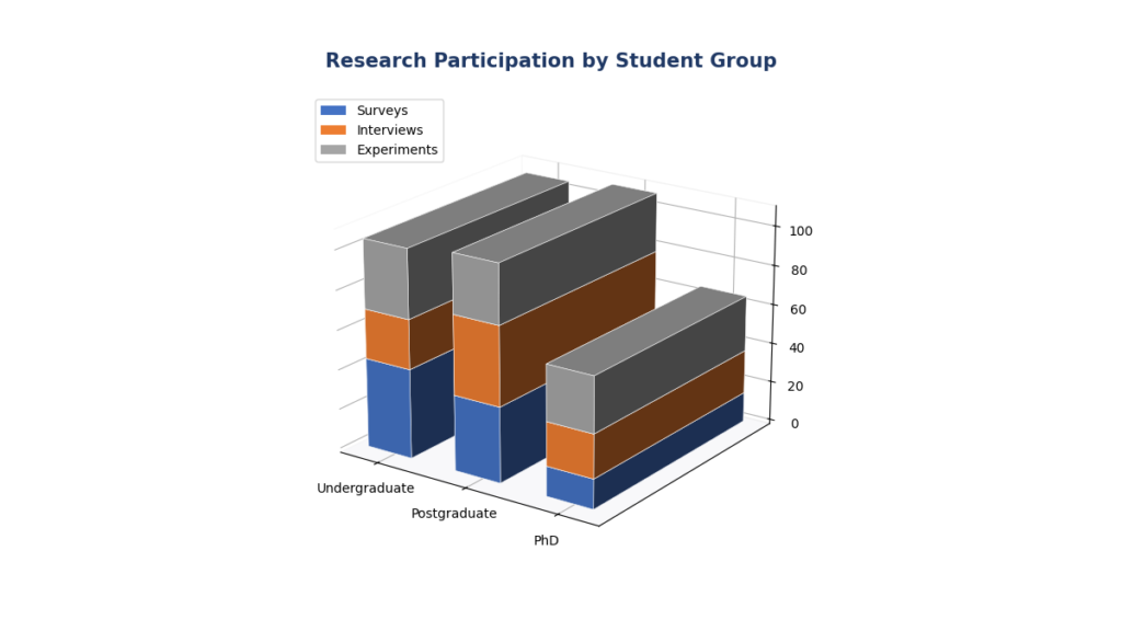
Use a standard stacked chart when the total number matters (for example, total research activities per student group). Use a 100% stacked chart when only the relative composition matters and the raw totals are not directly comparable, for instance if the student groups are different sizes.
GRAPH 3: 3D Stacked Bar Chart
How to Customize a 3D Bar Chart in Excel
Once the base chart is inserted, most formatting happens inside three areas:
- Chart Design: adds or removes chart elements (titles, labels, legend, gridlines) and offers pre-built color and style combinations.
- Format (or Format Chart Area, accessed by right-clicking): controls the overall chart background, borders, fonts, and 3D rotation settings.
- Format Data Series: controls the appearance of the bars themselves, including fill color, gap width, and bar depth.
Practical settings worth adjusting for a clean academic or business chart:
- Gap width: controls the spacing between bars in the same category; smaller values make bars appear thicker.
- Chart depth: controls how far back the 3D bars extend; keep this modest so bars in the back row are not hidden behind bars in front.
- Legend position: move the legend to the top or right if it overlaps the bars.
- Gridlines: light gridlines help readers judge values without cluttering the chart.
- Chart size: resize the chart object so labels are not cramped, particularly with longer category names.
Keep formatting decisions focused on readability rather than decoration. Extra shadow effects, bevels, or bright gradients add visual noise without adding information.
How to Change 3D Rotation in Excel
The 3D rotation controls determine how much perspective is applied to the chart, and they have a direct effect on how easy the chart is to read.
- Select the chart by clicking it once.
- Right-click anywhere on the Chart Area (the outer background, not a bar).
- Choose Format Chart Area from the shortcut menu.
- In the Format Chart Area pane, click the Effects icon.
- Expand 3-D Rotation.
- Adjust X Rotation to tilt the chart left or right.
- Adjust Y Rotation to tilt the chart forward or backward.
- Adjust Perspective, where available, to control how strongly depth is exaggerated.
Small rotation adjustments (roughly 10 to 20 degrees) usually keep bars easy to compare. Large rotation values can hide shorter bars behind taller ones or make bars in the back row appear smaller than their true value relative to bars in front. This is one of the main reasons 3D charts are approached cautiously in academic reporting.
How to Add Data Labels
- Select the chart.
- Open Chart Design > Add Chart Element, or click the Chart Elements (+) icon next to the chart.
- Choose Data Labels.
- Select a readable position, such as Outside End.
- If needed, right-click a label and choose Format Data Labels to adjust number formatting (for example, adding a percentage sign or removing decimal places).
Data labels matter more on 3D charts than on flat 2D charts because perspective can distort how bar length reads against the axis. A visible number removes any ambiguity about the exact value a bar represents.
How to Change the Colors of a 3D Bar Chart
- Click once on a bar to select the entire data series.
- Right-click and choose Format Data Series.
- Under Fill, choose a solid color, and apply the same treatment consistently across every series so the chart does not look mismatched.
- Avoid heavy gradients, textures, or 3D bevel effects for academic figures. A plain, high-contrast fill color is easier to reproduce in grayscale printing and easier to interpret at a glance.
For dissertation or thesis figures, restrained formatting with good contrast between series is preferable to decorative styling, since examiners and reviewers generally expect clarity over visual flourish.
2D vs 3D Bar Chart
| Feature | 2D Bar Chart | 3D Bar Chart |
|---|---|---|
| Readability | Easier to read exact values | Can be harder due to perspective |
| Visual appeal | Simple, clean | More visually engaging |
| Exact comparison | Strong; bars align directly with gridlines | Weaker; depth can distort perceived length |
| Academic reporting | Generally preferred | Used cautiously, with clear labeling |
| Presentation use | Effective but plain | Effective for slides and visual impact |
| Risk of distortion | Low | Moderate to high with steep rotation |
| Best use case | Statistical or scientific reporting | Business presentations, simple visual summaries |
A 2D bar chart is generally the better choice whenever the reader needs to compare values precisely. A 3D chart is not statistically superior in any sense. It is a stylistic choice that trades some precision for visual depth, and that trade-off should be a deliberate one rather than a default setting.
Clustered vs Stacked 3D Bar Charts
| Chart Type | Best Used For |
|---|---|
| 3D Clustered Bar | Comparing groups side by side within each category (e.g., undergraduate vs postgraduate) |
| 3D Stacked Bar | Comparing totals and the components that make them up (e.g., total research activity by group) |
| 3D 100% Stacked Bar | Comparing percentage composition across groups regardless of group size |
When Should You Use a 3D Bar Chart?
3D bar charts are a reasonable choice for:
- Business or classroom presentations where visual style supports engagement.
- Simple categorical comparisons with a small number of categories.
- Demonstrations, training materials, or slide decks.
- Descriptive reporting where exact precision is secondary to a quick visual summary.
When Should You Avoid a 3D Bar Chart?
3D formatting becomes counterproductive in several common situations:
- Complex datasets with many categories, where depth makes bars overlap or obscure one another.
- Many categories or series, since a cluttered 3D chart becomes difficult to scan.
- Precise scientific comparison, where the reader needs to judge small differences accurately.
- Publication-quality statistical figures, where journals and most style guides (including APA) favor flat, unambiguous charts.
- Any situation where depth creates visual distortion strong enough to misrepresent the underlying data.
How to Interpret a 3D Bar Chart
Looking at Graph 1 (Research Methods Used by Students), the data shows:
- Highest category: Surveys, with 45 students.
- Lowest category: Observation, with 20 students.
- Relative pattern: Surveys and Experiments together account for the largest share of research activity, while Observation and Focus Groups are used less frequently.
This is a descriptive summary only. A chart showing that Surveys (45) appear more often than Observation (20) describes the sample in front of you. It does not, by itself, establish that this difference is statistically significant or generalizable to a wider population. Confirming whether a difference is meaningful beyond the sample requires an appropriate inferential test (such as a chi-square test for categorical frequencies), not just a visual comparison of bar heights.
Common Problems and Fixes
| Problem | Likely Cause | Solution |
|---|---|---|
| 3D chart option is greyed out | Wrong data selected, or selection includes blank rows/columns | Reselect a clean, contiguous range with headers before opening Insert Column or Bar Chart |
| Categories and values appear reversed | Data organized in the wrong orientation (rows vs columns) | Use Chart Design > Switch Row/Column to flip the axis assignment |
| Bars look distorted or unevenly sized | Excessive 3D rotation or perspective | Reduce X/Y Rotation and Perspective under Format Chart Area > Effects > 3-D Rotation |
| Labels overlap each other | Too many categories or long category names | Increase chart size, rotate label text, or switch to a bar chart (horizontal) for long labels |
| Legend is confusing | Series names are unclear or too many series are included | Rename series headers in the worksheet before charting, and limit series to what is essential |
| Chart looks overcrowded | Too many categories or series combined in one chart | Split the data into two smaller charts, or switch to a 100% stacked view to simplify comparison |
| Perspective makes values difficult to compare | Steep 3D rotation combined with missing data labels | Add data labels and reduce rotation to a modest angle (10 to 20 degrees) |
Excel vs SPSS for Bar Charts
Because Excel and SPSS are both common tools in dissertation and research workflows, it helps to know when each is the more appropriate choice.
| Feature | Excel | SPSS |
|---|---|---|
| Ease of use | Very accessible; most students already know the basics | Requires learning Chart Builder and the Analyze menu |
| Quick charts | Fast for simple visual summaries | Slightly slower but tightly linked to the dataset |
| Statistical analysis | Limited; mainly descriptive functions | Full range of inferential statistics (t-tests, ANOVA, regression, chi-square, and more) |
| Research workflow | Best for presentation-ready visuals after analysis is complete | Best when charts need to stay connected to the statistical procedure that produced them |
| Advanced statistics | Not designed for this | Core purpose of the software |
| Reproducibility | Manual; harder to regenerate identically | Chart Builder settings and syntax can be reused consistently |
| Dissertation use | Good for supplementary figures and slides | Preferred when charts accompany formal statistical output in Chapter 4 |
In practice, Excel is convenient for building a quick, polished chart when the underlying analysis has already been completed elsewhere, or when a chart is needed for a presentation, proposal, or summary document. SPSS becomes the more appropriate tool once a chart needs to stay connected to the statistical procedure that generated it, for example a bar chart built directly from a frequency analysis or a clustered bar chart generated alongside a crosstabulation. If you are building descriptive charts as part of dissertation results, it is often worth comparing both approaches; our guide on how to create a bar chart in SPSS walks through the equivalent process using Chart Builder.
The right choice depends on where the chart sits in your research workflow, not on which software is generally “better.”
FAQ
Select your data range including headers, go to the Insert tab, click Insert Column or Bar Chart, and choose one of the options under 3-D Bar. Excel builds the chart automatically, after which you can add titles, labels, and formatting.
It is under the Insert tab, inside the Insert Column or Bar Chart menu in the Charts group. The 3-D Bar subtypes appear in their own section of that dropdown gallery, separate from the 2-D options.
Arrange your data with categories in one column and each comparison group in its own column, select the full range, then choose 3-D Clustered Bar from Insert Column or Bar Chart. Excel places each group’s bar side by side within every category.
Use the same multi-series layout as a clustered chart, but choose 3-D Stacked Bar (or 3-D 100% Stacked Bar) instead. Excel stacks each series on top of the others within a single bar per category.
Right-click the Chart Area, select Format Chart Area, open the Effects icon, and expand 3-D Rotation. Adjust the X Rotation, Y Rotation, and Perspective sliders to change the viewing angle.
Select the chart, open Chart Elements (the + icon) or Chart Design > Add Chart Element, choose Data Labels, and select a position such as Outside End. Labels are especially useful on 3D charts because perspective can obscure exact values.
A 3D bar chart uses horizontal bars with categories on the vertical axis, while a 3D column chart uses vertical bars with categories on the horizontal axis. Both are found under the same Insert Column or Bar Chart menu, in separate sections.
They can be used for simple, low-stakes descriptive summaries, but most academic style guides and journals prefer flat 2D charts for statistical or publication-quality figures, since 3D perspective can distort how differences between bars are perceived.
Conclusion
Creating a 3D bar chart in Excel comes down to a short, repeatable process: organize your categories and values into a clean two-column table, select the range, insert the appropriate 3-D Bar (or 3-D Column) subtype from the Insert tab, and then customize the title, axis labels, data labels, and 3D rotation until the chart is easy to read. Clustered charts work well when comparing groups side by side, while stacked and 100% stacked charts are better suited to showing totals or proportions. Because 3D formatting introduces perspective, it is worth using it carefully wherever accurate visual comparison matters. Favor modest rotation, clear data labels, and, for formal statistical reporting, consider a flat 2D chart instead.
If you are preparing charts and figures as part of a dissertation, thesis, or research report, the choice between Excel and SPSS often depends on how closely your visuals need to stay connected to your statistical analysis. For support turning SPSS output into clear, dissertation-ready graphs, tables, and results write-ups, our SPSS data analysis and statistical analysis support services can help you take a chart like the ones above from a rough draft to a polished, defensible figure in your results chapter.
