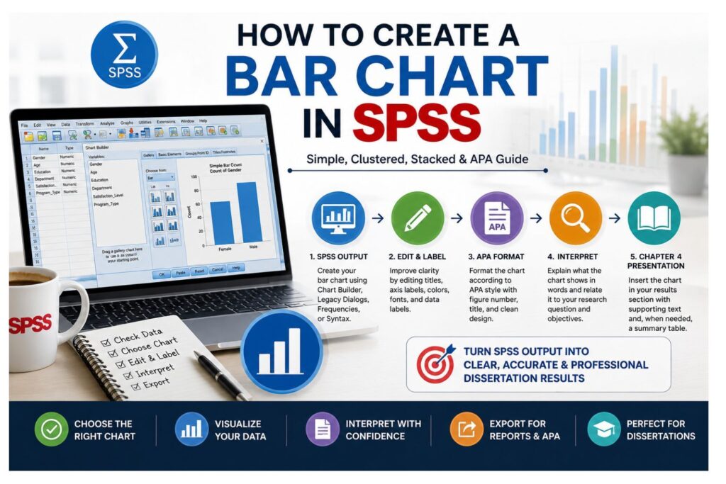
To create a bar chart in SPSS, go to Graphs > Chart Builder, select Bar, drag a Simple Bar chart into the preview area, place your categorical variable on the x-axis, choose whether the bars should display counts, percentages, means, or another statistic, then click OK. You can also create bar charts through Graphs > Legacy Dialogs > Bar, Analyze > Descriptive Statistics > Frequencies, or SPSS syntax.
Bar charts are among the most useful graphs in SPSS because they help students, researchers, and dissertation writers summarize categorical data clearly. They are commonly used to display survey responses, compare groups, present demographic characteristics, show percentages, and summarize mean scores across categories.
For example, a student may use a bar chart to show how many respondents selected Strongly Disagree, Disagree, Neutral, Agree, or Strongly Agree in a Likert-scale survey question. A researcher may use a clustered bar chart to compare satisfaction levels by gender, treatment group, academic program, department, or intervention category. A dissertation student may use bar charts in Chapter 4 to make descriptive results easier for readers to understand.
Creating a useful SPSS bar chart requires more than selecting a graph from the menu. The variable type must match the chart type, the category labels must be clear, the y-axis must show the correct statistic, and the final chart must be interpreted carefully. Counts, percentages, clustered bars, stacked bars, and mean bars each serve a different purpose, so choosing the correct option is important for accurate reporting.
If your bar chart is part of a dissertation, thesis, capstone project, or research paper and you are unsure whether to use counts, percentages, clustered bars, stacked bars, or mean bars, SPSS Dissertation Help can assist with data cleaning, SPSS chart creation, APA formatting, output interpretation, and Chapter 4 results writing.
What Is a Bar Chart in SPSS?
A bar chart in SPSS is a graph that uses rectangular bars to represent values across categories. Each bar represents one category, and the height or length of the bar represents a value such as frequency, percentage, mean, sum, or another summary statistic.
Bar charts are mainly used for categorical variables. These include nominal and ordinal variables such as gender, education level, marital status, employment status, academic program, department, treatment group, satisfaction level, and survey response category.
For example, if your dataset contains a variable called Education Level, with categories such as diploma, bachelor’s degree, master’s degree, and doctorate, a bar chart can show how many respondents fall into each education category. The education categories appear on the x-axis, while the number or percentage of respondents appears on the y-axis.
Bar charts can also summarize a scale variable across categories. For example, you can create a bar chart showing the mean exam score by program type, mean satisfaction score by department, mean anxiety score by treatment group, or average performance score by training condition. In that case, the x-axis contains the groups, while the y-axis represents the average value of the scale variable.
SPSS allows users to create bar charts through several routes:
- Chart Builder
- Legacy Dialogs
- Frequencies
- SPSS syntax
- Charts produced from some statistical procedures
The best method depends on the purpose of the chart. Chart Builder is flexible and visual. Legacy Dialogs are fast for simple charts. Frequencies are useful when you want a frequency table and bar chart together. Syntax is helpful when you want to save, document, or reproduce your work.
A bar chart should not be confused with a histogram. A bar chart is usually used for categorical variables, while a histogram is used for continuous or scale variables. For example, satisfaction level fits a bar chart, while age, income, reaction time, blood pressure, and exam score may require a histogram.
For a broader overview of SPSS graphs, see How to Create Graphs in SPSS.
When Should You Use a Bar Chart in SPSS?
Use a bar chart in SPSS when you want to compare values across categories. Bar charts work well when the reader needs to understand patterns quickly without studying a long table.
A bar chart is appropriate when you want to:
- Show the frequency distribution of one categorical variable.
- Display survey response categories.
- Compare counts across categories.
- Compare percentages across categories.
- Compare mean scores across groups.
- Present demographic information.
- Visualize Likert-scale responses.
- Support descriptive statistics in a dissertation or research report.
- Present findings before or after statistical testing.
For example, if your study asks participants to rate their satisfaction with online learning as Very Dissatisfied, Dissatisfied, Neutral, Satisfied, or Very Satisfied, a bar chart can show the number or percentage of respondents in each response category.
Bar charts are also useful for demographic summaries. You can use them to show the number of respondents by gender, education level, employment status, class year, department, region, age group, or program type. In a dissertation Chapter 4, these charts help readers understand the sample before reviewing hypothesis tests, research question findings, or inferential analysis.
Bar charts also support group comparisons. For example, a clustered bar chart can compare satisfaction levels by gender or treatment outcome by intervention group. However, a chart alone does not prove statistical significance. If your research question involves testing differences or associations, you need the correct statistical test.
A bar chart works best when categories are meaningful and limited in number. If a variable has too many categories, the chart may become crowded and difficult to read. In that case, consider grouping categories, sorting them logically, or presenting the information in a table.
Bar Chart vs Histogram in SPSS
Students often confuse bar charts and histograms because both use bars. The key difference is the type of data being displayed.
A bar chart is mainly used for categorical variables. These variables place cases into groups or categories. Examples include gender, education level, department, program type, marital status, employment category, and Likert-scale response.
A histogram is used for continuous or scale variables. These variables measure values along a numeric scale. Examples include age, income, height, weight, test score, blood pressure, length of stay, and response time.
| Feature | Bar Chart | Histogram |
|---|---|---|
| Best for | Categorical variables | Continuous or scale variables |
| Variable type | Nominal or ordinal | Scale |
| Bar spacing | Bars usually have gaps | Bars usually touch |
| Main purpose | Compare categories | Show distribution shape |
| Common use | Survey responses, demographics, group counts | Age, test scores, income, blood pressure |
| Example | Satisfaction level by response category | Distribution of exam scores |
For example, if you want to show how many respondents selected each satisfaction response, use a bar chart. If you want to show whether age is normally distributed, use a histogram.
Choosing the wrong graph can confuse the reader. A bar chart for a continuous variable may hide the shape of the distribution, while a histogram for categorical responses may be inappropriate.
If your variable is continuous, see How to Create a Histogram in SPSS.
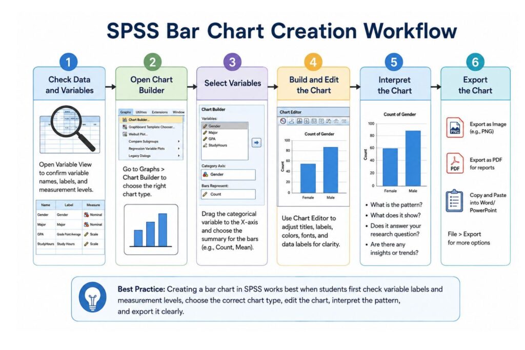
Before Creating a Bar Chart: Check Your SPSS Data First
Before creating a bar chart in SPSS, check your dataset carefully. Many chart problems come from poor data preparation, missing value labels, wrong measurement levels, active filters, or unclean categories.
Start with Variable View. Check the variable name, variable label, value labels, missing values, and measurement level. If your categorical variable uses numeric codes, add value labels so SPSS displays meaningful category names.
For example:
| Code | Value Label |
|---|---|
| 1 | Male |
| 2 | Female |
| 3 | Prefer not to say |
Without value labels, your chart may show 1, 2, and 3 instead of meaningful labels. That makes the chart unclear and unprofessional.
Next, check the measurement level. Categorical variables should usually be set as Nominal or Ordinal. Scale variables should be set as Scale. This matters because SPSS Chart Builder uses measurement levels when deciding how variables can be placed in charts.
You should also check missing values. Missing responses can affect counts, percentages, and interpretation. If some participants skipped a survey item, the chart may use fewer cases than the full sample size. That is why it is important to know whether your chart is based on total cases or valid cases.
Running a frequency analysis before creating the chart is a good habit. Frequency tables help confirm categories, counts, percentages, valid percentages, and missing values. For a detailed walkthrough, see How to Run a Frequency Analysis in SPSS.
Data cleaning is also important before creating final charts. Check for duplicate entries, incorrect category codes, inconsistent spelling, missing labels, and unusual values. A chart created from unclean data can produce misleading results. For more help, see How to Clean Data in SPSS.
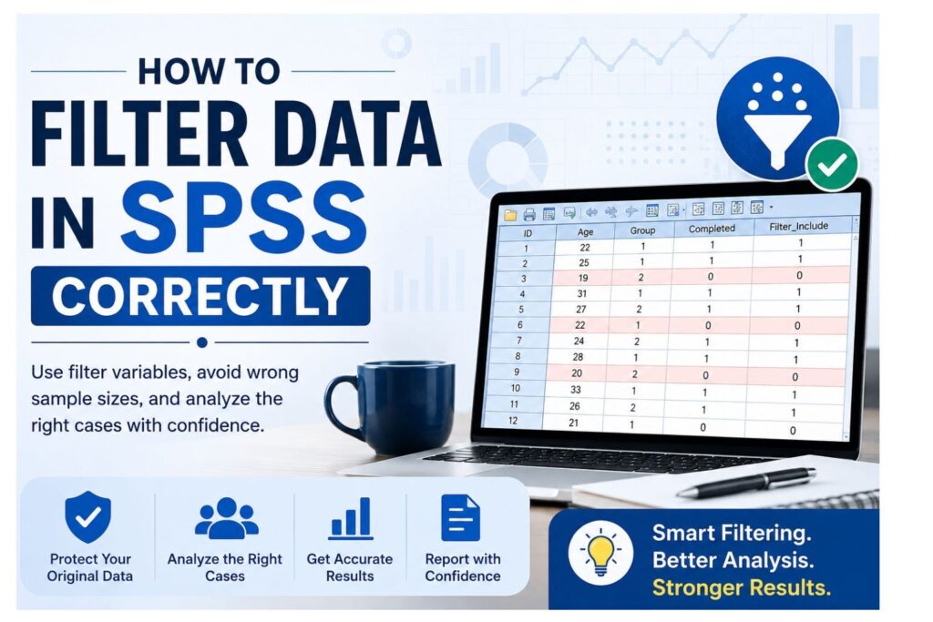
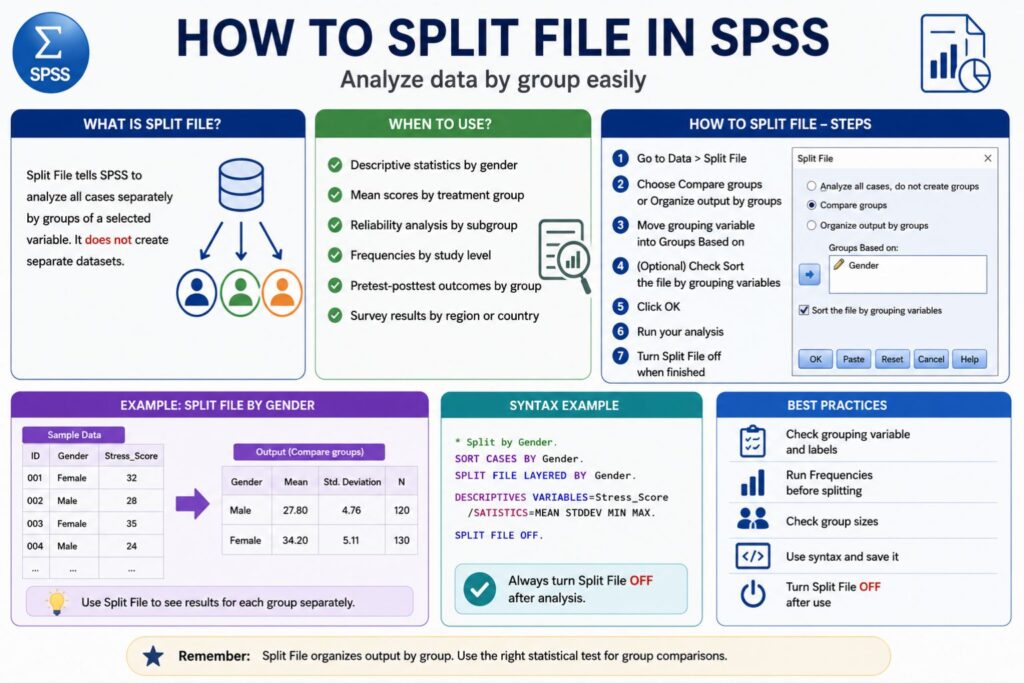
Also check whether Select Cases, Filter, or Split File is active. These settings can change the output without warning. If Split File is active, SPSS may create separate charts for each group. If Select Cases or Filter is active, some cases may be excluded from the chart.
Helpful SPSS data preparation resources:
- How to Select Cases in SPSS
- How to Filter Data in SPSS
- How to Split File in SPSS
- How to Sort Cases in SPSS
- How to Recode Variables in SPSS
- How to Compute Variables in SPSS
Good bar charts begin with clean, well-labeled, correctly coded data.
.
Method 1: How to Create a Simple Bar Chart in SPSS Using Chart Builder
Chart Builder is one of the best options for creating a bar chart in SPSS because it gives a visual preview before producing the chart. It is flexible, beginner-friendly, and suitable for simple, clustered, stacked, and mean bar charts.
Follow these steps to create a simple bar chart in SPSS:
- Open your dataset in SPSS.
- Click Graphs in the top menu.
- Select Chart Builder.
- If SPSS displays a message about measurement levels and value labels, click OK after confirming your variables are correctly defined.
- In the Gallery tab, choose Bar.
- Drag the Simple Bar chart into the preview area.
- Drag your categorical variable to the x-axis.
- Choose what the bars should represent, such as count, percentage, mean, or another statistic.
- Add a title if needed.
- Click OK.
- Review the chart in the SPSS Output Viewer.
For example, suppose your variable is Satisfaction_Level. Drag this variable to the x-axis and set the bars to show the number of respondents in each satisfaction category.
The x-axis will show categories such as Very Dissatisfied, Dissatisfied, Neutral, Satisfied, and Very Satisfied. The y-axis will show the count or percentage of respondents in each category.
Example: Bar Chart of Survey Responses in SPSS
Assume you collected survey data on student satisfaction with online learning. Your variable is Satisfaction_Level, and the categories are:
- Very Dissatisfied
- Dissatisfied
- Neutral
- Satisfied
- Very Satisfied
A simple bar chart can show how many students selected each response. This is useful for descriptive analysis because readers can quickly identify the most common and least common responses.
A written interpretation may look like this:
“The bar chart shows that most respondents reported being satisfied or very satisfied with online learning. Fewer respondents selected dissatisfied or very dissatisfied, suggesting a generally positive response pattern.”
This interpretation is descriptive. It does not claim that one category is statistically different from another. If your research question requires statistical testing, you may need a chi-square test, t-test, ANOVA, or another method depending on your variables.
Example: Bar Chart of Mean Score by Group
You can also use a bar chart to compare mean scores across groups.
For example:
- Categorical variable: Program_Type
- Scale variable: Exam_Score
- Goal: Compare mean exam scores across program types
In Chart Builder, place Program_Type on the x-axis and set the y-axis to show the mean of Exam_Score.
This type of chart is useful when comparing average scores across categories. However, a mean bar chart does not show the full distribution of scores. If your report requires more detail, consider adding error bars, confidence intervals, standard deviations, or a supporting table.
Method 2: How to Create a Bar Chart in SPSS Using Legacy Dialogs
SPSS Legacy Dialogs provide another way to create bar charts. This method is useful when you need a quick chart without using the full Chart Builder interface.
Follow these steps:
- Click Graphs.
- Select Legacy Dialogs.
- Click Bar.
- Choose Simple.
- Select Summaries for groups of cases.
- Click Define.
- Move your categorical variable into the Category Axis box.
- Choose whether the bars should represent N of cases, percentage, or another statistic.
- Add a title if needed.
- Click Continue.
- Click OK.
This method is suitable for a basic bar chart showing counts or percentages. For example, if you want to show the number of respondents by employment status, place Employment_Status in the Category Axis box and choose N of cases.
Legacy Dialogs are less flexible than Chart Builder, but they are fast and useful for simple frequency charts. If you need clustered bars, stacked bars, custom statistics, or more control over chart appearance, Chart Builder may be better.
Method 3: How to Create a Bar Chart in SPSS Using Frequencies
You can create a bar chart while running a frequency analysis in SPSS. This is one of the easiest methods when the goal is to summarize one categorical variable.
Follow these steps:
- Click Analyze.
- Select Descriptive Statistics.
- Click Frequencies.
- Move your categorical variable into the Variables box.
- Click Charts.
- Select Bar charts.
- Choose Frequencies or Percentages.
- Click Continue.
- Click OK.
SPSS will generate a frequency table and a bar chart. This is useful because the table gives exact values, while the chart provides a visual summary.
For example, you may use this method to summarize gender, education level, marital status, academic program, class level, employment status, or satisfaction category.
In dissertation writing, it is often helpful to present both a table and a chart when the variable is important. The table gives exact frequencies and percentages. The chart helps readers understand the pattern quickly.
For a full explanation of frequency tables, valid percent, missing values, and interpretation, see How to Run a Frequency Analysis in SPSS.
Method 4: SPSS Bar Chart Syntax
SPSS syntax allows you to create bar charts using commands instead of menus. Syntax is useful because it documents the analysis process and makes the work easier to reproduce.
This is especially helpful for dissertations and theses because it creates an audit trail. If your supervisor, statistician, or committee asks how the chart was created, syntax provides a clear record.
Frequency Bar Chart Syntax
FREQUENCIES VARIABLES=Gender
  /BARCHART FREQ
  /ORDER=ANALYSIS.
This command creates a frequency bar chart for the variable Gender.
Percentage Bar Chart Syntax
FREQUENCIES VARIABLES=Satisfaction_Level
  /BARCHART PERCENT
  /ORDER=ANALYSIS.
This command creates a percentage bar chart for Satisfaction_Level.
Simple Bar Chart Using GRAPH Syntax
GRAPH
  /BAR(SIMPLE)=COUNT BY Satisfaction_Level
  /TITLE='Satisfaction Level of Respondents'.
This command creates a simple bar chart showing the count of cases in each satisfaction category.
Percentage Bar Chart Using GRAPH Syntax
GRAPH
  /BAR(SIMPLE)=PCT BY Satisfaction_Level
  /TITLE='Percentage Distribution of Satisfaction Level'.
This command creates a simple bar chart showing percentages instead of counts.
Syntax is useful when you need to create similar charts for multiple variables. Instead of repeating menu steps, copy the syntax, change the variable name, and run the command again.
How to Create a Clustered Bar Chart in SPSS
A clustered bar chart compares categories across another grouping variable. It places bars side by side within each category.
For example, you may use a clustered bar chart to compare satisfaction levels by gender, treatment group, program type, department, or class level.
A clustered bar chart is useful when you have two categorical variables and want to compare patterns across groups.
Example:
- Main category variable: Satisfaction_Level
- Grouping variable: Gender
- Goal: Compare satisfaction responses by gender
Follow these steps using Chart Builder:
- Click Graphs.
- Select Chart Builder.
- Choose Bar from the Gallery.
- Drag Clustered Bar into the preview area.
- Place the main category variable on the x-axis.
- Place the grouping variable in the cluster or color grouping area.
- Choose whether the bars should show counts or percentages.
- Add a clear title.
- Click OK.
The output will show bars grouped by the main category, with separate bars for each subgroup.
Clustered bar charts are useful when visualizing chi-square results or comparing response patterns across groups. For example, if you conducted a chi-square test to examine whether satisfaction level differs by gender, a clustered bar chart can help illustrate the pattern.
Do not overload a clustered bar chart. If both variables have many categories, the chart can become crowded. In that case, consider collapsing categories, using a table, or choosing a different visualization.
How to Create a Stacked Bar Chart in SPSS
A stacked bar chart shows how subcategories contribute to each main category. Instead of placing bars side by side, SPSS stacks subgroup values within each bar.
For example, you may use a stacked bar chart to show the distribution of satisfaction responses within each department, treatment group, or program type.
A stacked bar chart is useful when you want to show a part-to-whole relationship. However, it can become difficult to interpret if there are too many categories or colors.
Follow these steps:
- Click Graphs.
- Select Chart Builder.
- Choose Bar from the Gallery.
- Drag Stacked Bar into the preview area.
- Place the main categorical variable on the x-axis.
- Place the second categorical variable in the stack or color grouping area.
- Choose the statistic, such as count or percentage.
- Add a clear title.
- Click OK.
Example:
- X-axis variable: Program_Type
- Stack variable: Satisfaction_Level
- Goal: Show how satisfaction responses are distributed within each program type
Stacked bar charts can be useful for survey summaries, presentations, and descriptive reports. However, if your main goal is to compare categories side by side, a clustered bar chart may be clearer.
A 100% stacked bar chart may be better when you want to compare proportions rather than raw counts. For example, if one group has 200 respondents and another group has 40 respondents, raw counts may make the larger group appear more important. Percentages may provide a fairer comparison.
Simple vs Clustered vs Stacked Bar Chart in SPSS
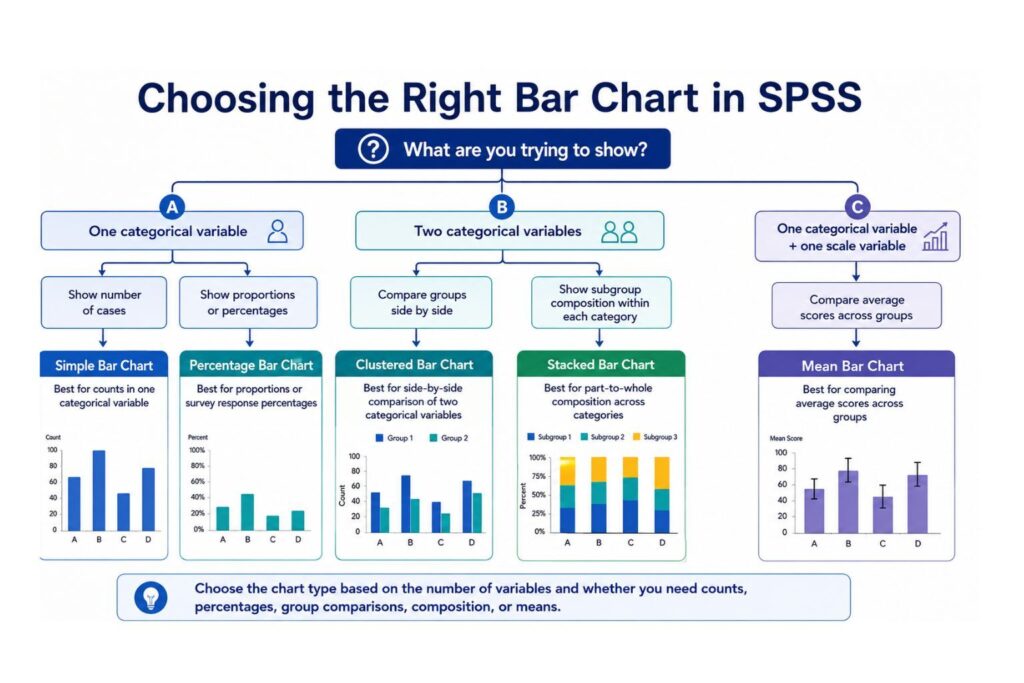
Choosing the right SPSS bar chart depends on your research question and the number of variables involved.
| Chart Type | Best For | Variables Needed | Example | Common Mistake |
|---|---|---|---|---|
| Simple bar chart | Showing one categorical variable | One categorical variable | Number of students by program | Using it for continuous data |
| Percentage bar chart | Showing proportions | One categorical variable | Percentage of respondents by satisfaction level | Confusing valid percent with total percent |
| Clustered bar chart | Comparing groups side by side | Two categorical variables | Satisfaction level by gender | Using too many categories |
| Stacked bar chart | Showing part-to-whole patterns | Two categorical variables | Satisfaction distribution by department | Making the chart too cluttered |
| Mean bar chart | Comparing average scores | One categorical and one scale variable | Mean exam score by program | Ignoring variability or error bars |
Use a simple bar chart when you have one categorical variable. Use a clustered bar chart when you want to compare two categorical variables side by side. Use a stacked bar chart when you want to show how subgroups contribute to each main category. Use a mean bar chart when comparing a scale outcome across groups.
If your variable is continuous, do not automatically use a bar chart. A histogram, boxplot, or scatterplot may be more appropriate.
How to Edit a Bar Chart in SPSS
After SPSS creates a bar chart, you can edit it using the Chart Editor.
To edit a bar chart:
- Go to the SPSS Output Viewer.
- Double-click the chart.
- The Chart Editor will open.
- Edit the title, axis labels, bar colors, data labels, fonts, legend, scale, and layout.
- Close the Chart Editor when finished.
You can edit many parts of the chart, including:
- Chart title
- X-axis label
- Y-axis label
- Category labels
- Bar color
- Data labels
- Bar spacing
- Legend
- Font size
- Gridlines
- Borders
- Y-axis scale
For academic work, keep the chart clean and simple. Avoid 3D effects, heavy borders, excessive colors, and unnecessary background designs. Dissertation charts should be readable, professional, and easy to interpret.
A weak chart title would be:
“Bar Chart”
A stronger chart title would be:
“Distribution of Respondents by Education Level”
or
“Satisfaction Responses by Treatment Group”
Axis labels should also be clear. Instead of using only Count, use Number of Respondents. Instead of using a variable name such as SAT_LEVEL, use a readable label such as Satisfaction Level.
If you plan to paste the chart into Word, check readability after resizing. A chart that looks clear in SPSS may become blurry or crowded in a dissertation document.
How to Add Percentages or Counts to a Bar Chart in SPSS
SPSS bar charts can display counts, percentages, means, or other statistics. The correct option depends on the purpose of the chart.
Use counts when the number of cases matters. For example, if you want to show that 45 respondents selected Agree, counts are appropriate.
Use percentages when you want to compare proportions. For example, if you want to show that 60% of respondents selected Agree, percentages are more helpful.
To create a percentage bar chart through Frequencies:
- Go to Analyze > Descriptive Statistics > Frequencies.
- Move your categorical variable into the Variables box.
- Click Charts.
- Select Bar charts.
- Choose Percentages.
- Click Continue.
- Click OK.
In dissertation writing, percentages are often easier to interpret than raw counts. However, it is best to provide the sample size as well. A percentage without the number of cases can be misleading.
Weak reporting:
“Most respondents agreed.”
Stronger reporting:
“Most respondents selected Agree or Strongly Agree, representing 75% of the valid sample.”
Even stronger reporting:
“Most respondents selected Agree or Strongly Agree, with 60 out of 80 valid respondents representing 75% of the valid sample.”
This version gives the reader both the percentage and the actual number of respondents.
How to Create APA-Style Bar Charts in SPSS
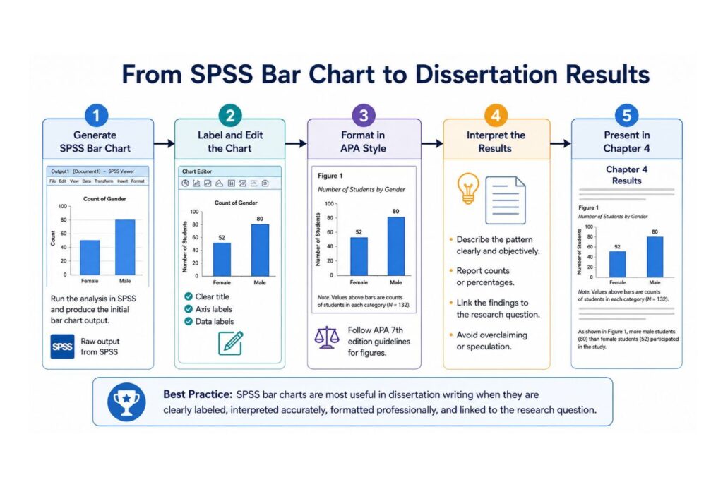
SPSS output is not always ready for direct submission. If your assignment, thesis, or dissertation requires APA-style presentation, you may need to edit the chart before adding it to your document.
An APA-style bar chart should be clear, simple, and properly labeled.
Use these principles:
- Add a figure number.
- Use a concise figure title.
- Label the x-axis clearly.
- Label the y-axis clearly.
- Use readable fonts.
- Avoid 3D effects.
- Avoid unnecessary borders.
- Avoid excessive colors.
- Use a figure note only when necessary.
- Explain the chart in the text.
Example APA-style presentation:
Figure 1
Distribution of Student Satisfaction Responses
A short written interpretation should follow or introduce the figure.
Example:
“Figure 1 shows the distribution of student satisfaction responses. Most respondents selected Agree or Strongly Agree, suggesting a generally positive response pattern.”
Do not let the chart stand alone. A figure should support your written results, not replace them.
Avoid overstating the chart. Do not write “Group A was significantly higher than Group B” unless you performed the correct statistical test and the result was statistically significant.
A chart shows a visual pattern. A statistical test evaluates whether the pattern is statistically meaningful.
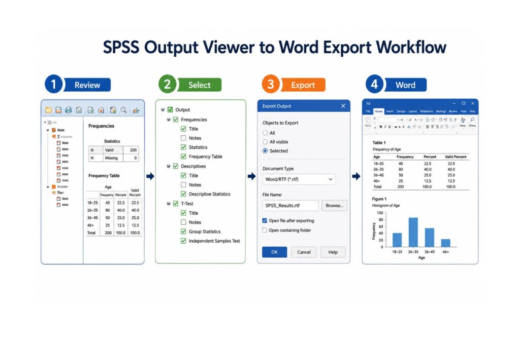
How to Export a Bar Chart from SPSS to Word
After creating a bar chart in SPSS, you may need to export it to Microsoft Word for an assignment, research report, thesis, or dissertation.
Option 1: Copy and Paste
- Go to the SPSS Output Viewer.
- Right-click the chart.
- Select Copy.
- Open your Word document.
- Paste the chart.
- Resize it carefully.
This method is fast, but the chart may become blurry if pasted or resized poorly.
Option 2: Export SPSS Output
- Go to File.
- Click Export.
- Choose your preferred file format.
- Select whether to export all output or selected output.
- Save the file.
- Insert the chart into Word if needed.
Option 3: Copy as Image
Some SPSS versions allow users to copy output as an image. This may help preserve chart formatting.
Before submitting your work, check:
- Is the chart readable?
- Are the labels clear?
- Is the title specific?
- Are the category labels visible?
- Is the image blurry?
- Does the chart match your written interpretation?
- Is the figure formatted according to your school’s requirements?
For a full export tutorial, see How to Export SPSS Output to Word.
How to Interpret a Bar Chart in SPSS
Creating a chart is only part of the task. The interpretation must also be accurate.
When interpreting a bar chart, ask:
- What variable is shown?
- What do the categories represent?
- Does the chart show counts, percentages, means, or another statistic?
- Which category has the tallest bar?
- Which category has the shortest bar?
- Are the differences visually meaningful?
- Is a statistical test needed?
- How does the chart connect to the research question?
Example interpretation for a simple bar chart:
“The bar chart shows that the largest number of respondents selected Agree, followed by Strongly Agree. This suggests that most participants had a positive view of the program.”
Example interpretation for a clustered bar chart:
“The clustered bar chart suggests that satisfaction responses varied by program type. Students in Program A appeared more likely to select Agree or Strongly Agree than students in Program B.”
Example interpretation for a percentage bar chart:
“The percentage bar chart shows that 62% of respondents selected Agree or Strongly Agree, while 18% selected Disagree or Strongly Disagree. This indicates that positive responses were more common than negative responses.”
Be careful with language. Do not use words such as significant, predicts, causes, or proves unless your statistical analysis supports those claims.
A bar chart can show a pattern. It cannot, by itself, prove statistical significance, causation, or prediction.
Common Mistakes When Creating Bar Charts in SPSS
Students often make mistakes when creating bar charts in SPSS. These mistakes can weaken the quality of an assignment, dissertation, or research report.
Using a Bar Chart for Continuous Data
A bar chart is usually not the best graph for continuous variables such as age, income, test score, blood pressure, or reaction time. A histogram or boxplot may be more appropriate.
Forgetting Value Labels
If value labels are missing, SPSS may show numbers instead of category names. Always add value labels before creating final charts.
Using Too Many Categories
A bar chart with too many categories becomes difficult to read. Consider grouping categories or using a table instead.
Confusing Counts and Percentages
A chart showing counts is not the same as a chart showing percentages. Always check the y-axis before interpreting the chart.
Ignoring Missing Values
Missing values can affect both counts and percentages. Check frequencies before reporting results.
Forgetting Split File Is On
If Split File is active, SPSS may create separate charts for each group. Turn it off if you want one combined chart.
Using 3D Effects
3D charts may look attractive, but they can distort values and reduce academic quality. Use clean 2D charts.
Copying Blurry Charts into Word
Charts should remain readable after export. Blurry charts look unprofessional and may affect how your results are received.
Reporting Charts Without Explanation
Do not insert a chart without explaining what it shows. Every figure should be introduced, labeled, and interpreted.
Using Charts Instead of Statistical Tests
Charts help visualize results, but they do not replace statistical analysis. Use the correct test when your research question requires inference.
Troubleshooting SPSS Bar Chart Problems
| Problem | Likely Cause | Solution |
|---|---|---|
| My variable does not appear in Chart Builder | Wrong measurement level or variable type | Check Variable View and set the correct measurement level |
| SPSS shows numbers instead of labels | Value labels are missing | Add value labels in Variable View |
| My categories are missing | Missing values, filters, or selected cases | Check missing values, Select Cases, and Filter settings |
| My output is separated by group | Split File is active | Turn off Split File |
| My chart looks cluttered | Too many categories | Recode, combine, or sort categories |
| Percentages do not appear | Chart is set to counts | Choose percentages in Frequencies or Chart Builder |
| My chart is blurry in Word | Poor copy/export method | Export at higher quality or copy as image |
| Categories are in the wrong order | SPSS is using default order | Sort categories or recode values logically |
| My bars are too thin | Too many categories or layout issue | Reduce categories or resize the chart |
| I do not know which chart to use | Unclear research question | Match the chart type to your variable type and analysis goal |
Some chart problems are caused by earlier data management steps. If your categories were coded incorrectly, you may need to recode variables. See How to Recode Variables in SPSS and How to Compute Variables in SPSS.
If your dataset comes from multiple sources, check whether files were merged correctly. See How to Merge Files in SPSS.
How to Decide Which SPSS Bar Chart to Use
Choosing the correct SPSS bar chart depends on your variable type and research question.
Use this decision guide:
| Research Goal | Recommended Chart |
|---|---|
| Show number of respondents in one categorical variable | Simple bar chart |
| Show percentage distribution of survey responses | Percentage bar chart |
| Compare two categorical variables side by side | Clustered bar chart |
| Show subgroup composition within each category | Stacked bar chart |
| Compare mean scores across groups | Mean bar chart |
| Show distribution of a continuous variable | Histogram |
| Show relationship between two scale variables | Scatterplot |
| Present exact values for many categories | Table |
For example, use a simple bar chart if you want to show the number of respondents by gender. Use a percentage bar chart if you want to show the percentage of respondents by satisfaction level. Use a clustered bar chart if you want to compare satisfaction level by gender. Use a stacked bar chart if you want to show how satisfaction responses are distributed within each department.
The correct chart should make your findings easier to understand. It should not exaggerate differences, hide important information, or confuse the reader.
Bar Charts for Dissertation Chapter 4
Bar charts are useful in dissertation Chapter 4 because they help present results visually. They are especially helpful for descriptive statistics, demographic summaries, and survey findings.
You can use bar charts in Chapter 4 to:
- Summarize demographic variables.
- Present survey response distributions.
- Show group comparisons.
- Support frequency tables.
- Visualize descriptive findings.
- Present Likert-scale results.
- Support interpretation of tested hypotheses.
For example, a student may present a frequency table showing education level and then include a bar chart showing the same distribution visually. The table gives exact numbers, while the chart helps the reader understand the pattern quickly.
A strong Chapter 4 presentation may look like this:
“Table 2 presents the frequency distribution of respondents by education level. Figure 1 visually summarizes the same distribution. Most respondents had a bachelor’s degree, followed by a master’s degree. Fewer respondents reported diploma-level or doctoral-level education.”
This approach connects the table, figure, and written interpretation.
Do not overload Chapter 4 with too many charts. Use bar charts for important patterns, not every variable. Too many figures can make the chapter look crowded and unfocused.
Each chart should connect clearly to your research questions, objectives, hypotheses, or sample description.
Can We Help You Create SPSS Bar Charts?
Yes. SPSS Dissertation Help can assist with creating, editing, interpreting, and formatting SPSS bar charts for assignments, research reports, theses, dissertations, and capstone projects.
Many students can create a basic chart in SPSS, but they struggle with choosing the correct chart type, interpreting the graph, formatting it in APA style, and explaining it in Chapter 4. Others are unsure whether to use counts, percentages, means, clustered bars, stacked bars, or charts with error bars.
We can help with:
- SPSS data cleaning
- Variable labeling
- Value labels
- Frequency tables
- Simple bar charts
- Clustered bar charts
- Stacked bar charts
- Percentage bar charts
- Mean bar charts
- APA-style chart formatting
- SPSS output interpretation
- Dissertation Chapter 4 results writing
- Exporting charts to Word
- Matching charts to research questions
- Choosing the right statistical test after chart review
We do not simply copy SPSS output into your paper. We help turn raw SPSS output into clear, accurate, and professionally presented results.
SPSS Bar Chart Help Pricing
Pricing depends on the size and complexity of your project. A simple chart task costs less than a full dissertation data analysis project.
Your quote may depend on:
- Number of charts needed
- Dataset condition
- Number of variables
- Whether data cleaning is required
- Whether interpretation is required
- Whether APA formatting is required
- Whether Chapter 4 writing is needed
- Deadline urgency
- Complexity of the research questions
A basic SPSS bar chart task may involve creating one or more charts from a clean dataset. A more advanced project may include data cleaning, recoding, frequency tables, clustered charts, stacked charts, interpretation, APA formatting, and integration into Chapter 4.
To receive an accurate quote, share your dataset, assignment instructions, research questions, variables, deadline, and any required formatting guidelines.
Need help creating a bar chart in SPSS? Contact SPSS Dissertation Help today for expert support with SPSS graphs, APA tables, dissertation results, and research data analysis.
Why Choose SPSS Dissertation Help?
SPSS Dissertation Help provides student-focused support for SPSS analysis, charts, tables, interpretation, and dissertation reporting.
Students choose us because we offer:
- Dissertation-focused SPSS support
- Clear step-by-step assistance
- Help with charts, tables, and interpretation
- APA-ready presentation
- Support for undergraduate, master’s, PhD, and professional research projects
- Confidential handling of research data
- Customized support based on your research questions
- Fast turnaround depending on project size
- Help with survey, healthcare, psychology, education, business, and social science data
- Clear explanations instead of unexplained SPSS output
Whether you need one bar chart or a complete Chapter 4 results section, we can help you present your SPSS findings clearly and professionally.
Final Checklist Before Submitting an SPSS Bar Chart
Before submitting your SPSS bar chart, check the following:
- The correct variable type was used.
- The correct chart type was selected.
- Value labels are visible.
- Missing values were checked.
- The chart shows counts, percentages, or means correctly.
- The title is specific.
- Axis labels are clear.
- The chart is readable in Word.
- The chart is explained in the text.
- The chart supports the research question.
- You did not claim significance without a statistical test.
- The figure is formatted according to your assignment or dissertation guidelines.
This checklist helps ensure that your SPSS chart is not only visually clear but also academically useful.
Frequently Asked Questions About Creating Bar Charts in SPSS
To create a bar chart in SPSS, go to Graphs > Chart Builder, choose Bar, drag a simple bar chart into the preview area, place your categorical variable on the x-axis, choose the statistic, and click OK.
The easiest way is through Analyze > Descriptive Statistics > Frequencies. Move your variable into the Variables box, click Charts, choose Bar charts, select frequencies or percentages, and click OK.
Use Chart Builder when you want more control and customization. Use Legacy Dialogs when you want a quick simple bar chart. Both methods can create useful SPSS bar charts.
Go to Analyze > Descriptive Statistics > Frequencies, select your categorical variable, click Charts, choose Bar charts, select Percentages, and click OK.
Go to Graphs > Chart Builder, select Bar, drag a clustered bar chart into the preview area, place the main categorical variable on the x-axis, place the grouping variable in the cluster or color area, and click OK.
Go to Graphs > Chart Builder, choose Bar, drag a stacked bar chart into the preview area, place the main variable on the x-axis, add the second categorical variable as the stack or grouping variable, and click OK.
Double-click the chart in the SPSS output viewer to open the Chart Editor. Use the chart editing options to display data labels, adjust labels, and improve readability.
Right-click the chart in the SPSS Output Viewer, choose Copy, and paste it into Word. You can also use File > Export to export SPSS output. For more help, see How to Export SPSS Output to Word.
A bar chart is mainly used for categorical variables, while a histogram is used for continuous or scale variables. Bar charts usually have gaps between bars, while histogram bars usually touch.
Yes. A bar chart can be used to show the frequency or percentage distribution of Likert-scale responses such as Strongly Disagree, Disagree, Neutral, Agree, and Strongly Agree.
Yes. SPSS can create mean bar charts when you have one categorical grouping variable and one scale outcome variable. For example, you can compare mean satisfaction scores across departments.
Create the chart in SPSS, edit it for clarity, remove unnecessary decoration, use clear axis labels, and add a figure number and title in Word. Also explain the chart in the body of your report.
This usually happens because value labels are missing. Go to Variable View and add value labels for the coded categories.
Your Split File option may be active. Go to Data > Split File and select Analyze all cases, do not create groups if you want one combined chart.
Yes. We can help create, edit, interpret, export, and format SPSS bar charts for dissertations, theses, assignments, and research reports.
Conclusion
Creating a bar chart in SPSS is simple once you understand your variable type, chart purpose, and the correct SPSS method. A simple bar chart is best for one categorical variable. A percentage bar chart is useful for survey responses. A clustered bar chart compares categories across groups. A stacked bar chart shows part-to-whole patterns. A mean bar chart compares average scores across categories.
The most important step is choosing the right chart for your data. Before creating the chart, check your variable labels, value labels, measurement levels, missing values, filters, and Split File settings. After creating the chart, edit it for clarity, export it correctly, and interpret it accurately.
If your SPSS bar chart is part of a dissertation, thesis, capstone project, or research report, make sure it is not only visually clear but also properly connected to your research questions and results. SPSS Dissertation Help can assist with chart creation, SPSS output interpretation, APA formatting, and Chapter 4 results writing so your final work is accurate, professional, and ready for submission.