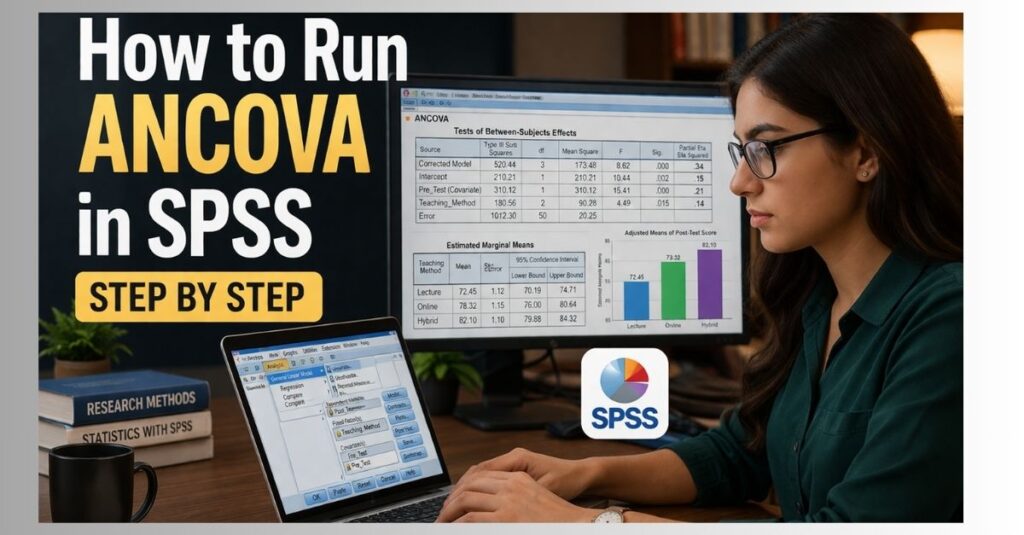
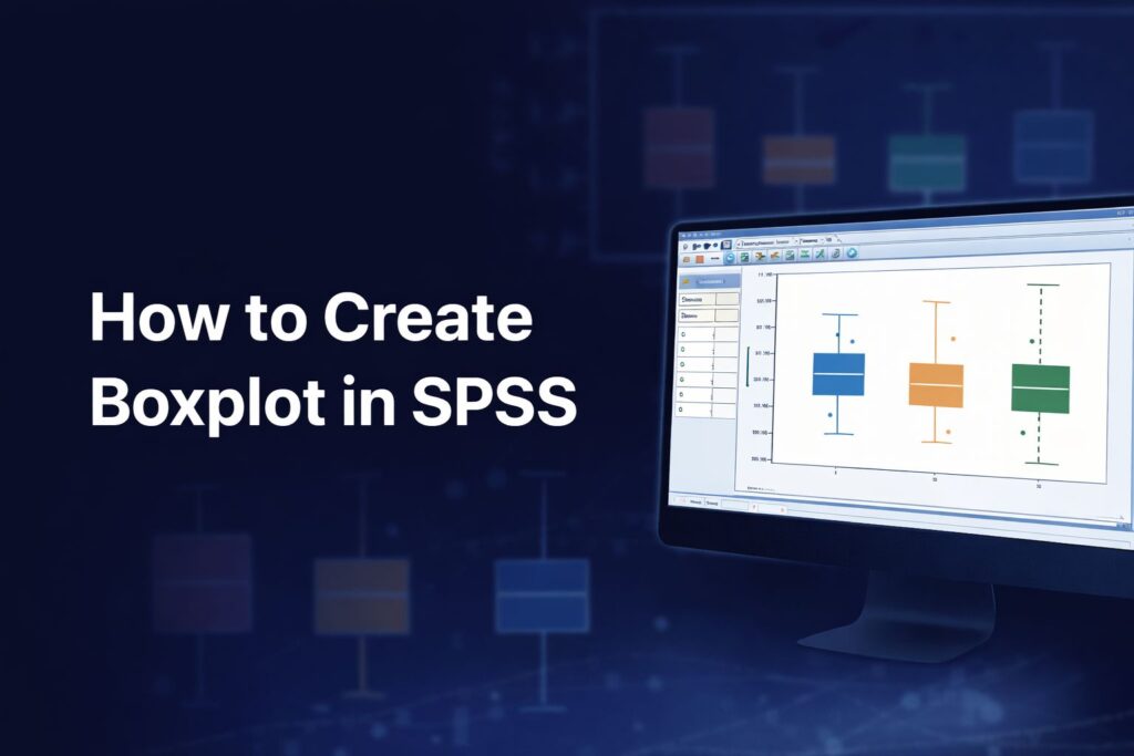
How to Create Boxplot in SPSS Step by Step for Research and Dissertation
Knowing how to create boxplot in SPSS is useful in many dissertations, theses, assignments, and research projects because boxplots help show the distribution of a variable in a clear visual form. IBM describes boxplots as charts that show the median, interquartile range, outliers, and extreme cases of individual variables, making them helpful for understanding spread and unusual observations in the data.
A boxplot is especially valuable when a researcher wants to inspect a continuous variable before running further analysis. It can help reveal whether the data are tightly grouped or widely spread, whether the median differs across groups, and whether unusual values may need attention before moving into descriptive statistics help, SPSS analysis help, or regression analysis help. IBM’s documentation also shows that boxplots can be created through both Graphs > Chart Builder and the Legacy Dialogs boxplot procedures in SPSS.
What a Boxplot Shows in SPSS
A boxplot summarizes the distribution of a numeric variable. IBM states that boxplots show the median, interquartile range, outliers, and extreme cases. This means the chart gives a quick view of central tendency, spread, and unusual observations without requiring a full table of descriptive statistics.
In practical research terms, the line inside the box represents the median, while the box itself reflects the middle portion of the data. The whiskers extend outward, and any points beyond the expected range may appear as outliers or extreme cases. This makes the boxplot useful for checking variability, comparing groups, and spotting values that may influence later findings.
When to Use a Boxplot in SPSS
A boxplot is appropriate when the researcher wants to examine a scale or continuous variable visually. It is commonly used in survey research, experimental studies, educational data, health data, financial data, and many other forms of quantitative work. IBM specifically describes boxplots as useful for visualizing the distribution of a scale variable and pinpointing outliers.
This kind of graph is often used before formal testing because it helps show what the data look like. A boxplot can support early data screening, comparison of distributions across categories, and visual inspection before writing up results. In many projects, this step fits naturally before questionnaire data analysis help, Likert scale analysis help, or Chapter 4 results and discussion help.
Where to Find Boxplot in SPSS
SPSS provides more than one route for creating a boxplot. IBM’s documentation shows a boxplot path under Graphs > Chart Builder, where the user selects Boxplot from the gallery and drags a simple boxplot onto the canvas. IBM also documents Boxplots under Legacy Dialog Charts, where users can choose simple or clustered boxplots and specify whether the chart summarizes groups of cases or separate variables.
That gives two common ways to create the chart:
- Graphs > Chart Builder
- Graphs > Legacy Dialogs > Boxplots
Both routes can be useful, depending on the structure of the dataset and the type of boxplot needed.
How to Create Boxplot in SPSS Using Chart Builder
One common way to create a boxplot in SPSS is through Chart Builder. IBM shows this workflow in its documentation by directing the user to Graphs > Chart Builder, selecting Boxplot from the gallery, dragging the Simple Boxplot icon onto the canvas, placing a scale variable on the y-axis, and placing a grouping variable on the x-axis when group comparison is needed.
Open the Dataset
Begin by opening the SPSS data file and checking that the variable you want to plot is numeric. Boxplots are used for numeric or scale-type variables because the chart summarizes the distribution of values.
Click Graphs
From the top menu, click Graphs.
Choose Chart Builder
Select Chart Builder.
Select Boxplot from the Gallery
In Chart Builder, go to the gallery of chart types and choose Boxplot. IBM’s documentation shows selecting the boxplot chart type and dragging the Simple Boxplot icon onto the canvas.
Drag the Variable to the Axis
Drag the continuous variable you want to visualize to the y-axis area. If you want to compare groups, drag the grouping variable to the x-axis. IBM’s example places a scale variable on the y-axis and a cluster or category variable on the x-axis.
Click OK
After placing the variables correctly, click OK. SPSS will create the boxplot in the Output Viewer. IBM documents this final step directly in its Chart Builder example.
How to Create Boxplot in SPSS Using Legacy Dialogs
Another common method is the Legacy Dialogs route. IBM documents Boxplots under Legacy Dialog Charts and explains that the dialog allows the user to choose the chart type and decide whether the data in the chart represent groups of cases or separate variables. IBM also states that boxplots show the median, interquartile range, outliers, and extreme cases of individual variables.
Go to Graphs
From the SPSS menu, click Graphs.
Choose Legacy Dialogs
Select Legacy Dialogs, then choose Boxplots.
Choose the Type of Boxplot
SPSS allows different boxplot structures. IBM documents simple and clustered boxplots, as well as boxplots that summarize groups of cases or separate variables.
A simple boxplot is often enough when one numeric variable is being displayed, either overall or across one grouping variable. A clustered boxplot is more suitable when a second grouping structure is needed.
Define the Data Structure
Under the dialog options, choose the structure that matches the data. IBM describes two common arrangements:
- Summaries for groups of cases
- Summaries of separate variables
If one continuous variable is being compared across categories such as gender, department, or treatment group, summaries for groups of cases may be appropriate. If several separate numeric variables are being displayed as their own boxes, summaries of separate variables may be more appropriate.
Enter the Variables
IBM’s documentation for Simple Boxplot Summaries of Separate Variables states that the user selects at least one numeric variable and moves it into the Boxes Represent field. IBM also notes that a variable can be moved into Label Cases By so that value labels or values can be used to label outliers or extreme cases on the plot. If no label variable is selected, case numbers can be used instead.
Adjust Options if Needed
IBM also states that the Options setting can be used to specify the treatment of missing values and control whether labels are displayed for outliers and extremes. The documentation further notes that one or more categorical variables can be moved into Panel By to create paneled charts.
Click OK
Once the variables and options are set, click OK to create the chart.
How to Create a Boxplot for Group Comparison in SPSS
A boxplot becomes especially useful when one continuous variable needs to be compared across categories. For example, a researcher may want to compare exam scores across departments, satisfaction across age groups, or anxiety levels across treatment conditions. IBM’s Chart Builder example illustrates this by placing a numeric variable on the y-axis and a grouping variable on the x-axis.
This kind of grouped boxplot can help reveal whether one category has a higher median, greater variability, or more outliers than another. It is often a helpful visual step before writing up independent samples t test help, ANOVA help, or broader inferential statistics help.
How to Interpret a Boxplot in SPSS
Interpreting a boxplot begins with the median. A higher median line suggests higher central values for that variable or group. The size of the box reflects the interquartile range, so a taller box suggests more spread in the middle half of the data. IBM identifies these features directly as part of what boxplots display.
Outliers and extreme cases are also important. These may indicate unusual observations, data-entry problems, or simply legitimate values at the edge of the distribution. IBM notes that boxplots can label outliers and extreme cases when a label variable is supplied, or use case numbers if no label variable is chosen.
When comparing groups, attention should be given to differences in median position, variation in box length, whisker length, and the presence of unusual values. The chart does not replace statistical testing, but it can make the pattern in the data easier to understand before formal analysis begins.
Why Boxplots Matter in Dissertation Research
In dissertation and thesis work, boxplots are useful because they help present the structure of the data in a visual way that readers can understand quickly. A table may show means and standard deviations, but a boxplot can reveal spread, asymmetry, and unusual values more directly. Since IBM describes the boxplot as a chart for showing distribution, interquartile range, outliers, and extreme cases, it fits naturally into data screening and results presentation.
A boxplot may be included in Chapter 4 when the researcher wants to support the interpretation of descriptive patterns, compare distributions across groups, or demonstrate how outliers were identified. This can strengthen reporting when combined with descriptive statistics help, SPSS dissertation help, and full Chapter 4 writing help.
Common Mistakes When Creating Boxplots in SPSS
One common mistake is selecting the wrong type of variable. A boxplot is designed for numeric or scale variables, so using the wrong field type can make the chart meaningless.
Another mistake is choosing the wrong boxplot structure. IBM distinguishes between summaries for groups of cases and summaries of separate variables, so the user needs to match the dialog choice to the dataset layout.
A third mistake is ignoring the labels for outliers. IBM provides the Label Cases By option so that unusual observations can be identified more clearly. Without labels, users may see outliers but not know which cases they belong to.
A fourth mistake is failing to think about missing values. IBM’s options dialog allows control over missing-value treatment and whether labels are shown for outliers and extremes. These settings can affect how the chart appears.
How to Report a Boxplot in a Dissertation or Thesis
A boxplot can be described briefly and clearly in academic writing. The explanation should mention the variable shown, the grouping variable if applicable, and the main pattern visible in the chart.
Examples include:
A boxplot was created in SPSS to examine the distribution of satisfaction scores and identify potential outliers.
A grouped boxplot was produced to compare anxiety scores across treatment conditions.
The boxplot showed a higher median score in the intervention group, with a wider interquartile range in the control group.
These kinds of statements fit naturally in Chapter 4 and help connect the visual presentation to the wider interpretation of results.
Get Help with Boxplots in SPSS
If you are struggling with SPSS graphs, outlier inspection, grouped comparisons, or dissertation-ready results presentation, expert guidance can make the work easier and more accurate. Support may include creating boxplots, interpreting visual output, checking distributions, identifying outliers, and linking the graph to the correct write-up in the results chapter.
This is often useful when moving from graphs into SPSS analysis help, descriptive statistics help, ANOVA help, regression analysis help, or complete SPSS dissertation help.
Frequently Asked Questions
Where is boxplot found in SPSS?
Boxplots can be created through Graphs > Chart Builder and also through Graphs > Legacy Dialogs > Boxplots in SPSS. IBM documents both routes.
What does a boxplot show in SPSS?
IBM states that boxplots show the median, interquartile range, outliers, and extreme cases of individual variables.
Can I create a grouped boxplot in SPSS?
Yes. IBM’s Chart Builder example shows placing a scale variable on the y-axis and a grouping variable on the x-axis to create a grouped boxplot.
Can SPSS label outliers on a boxplot?
Yes. IBM states that a variable can be placed in Label Cases By so that outliers or extreme cases are labeled by value labels or values, and if no such variable is selected, case numbers can be used.
Can I create boxplots for several variables at once?
Yes. IBM documents Simple Boxplot Summaries of Separate Variables, where at least one numeric variable can be moved into the Boxes Represent field.
Can I panel a boxplot in SPSS?
Yes. IBM states that one or more categorical variables can be moved into Panel By to create paneled charts.