
Pareto Chart in SPSS: Step-by-Step Guide
Reviewed by our SPSS statisticians, who’ve supported 500+ dissertation and thesis clients.
“Run a Pareto chart” is one of those instructions committee members hand out like it’s obvious, and then you open SPSS and nothing looks like what’s in your textbook. You’re not missing something. Most tutorials online were written years ago and still show menus that don’t match the current SPSS interface, or they show you how to click through the chart without ever explaining what you’re supposed to say about it afterward.
Below is the version we actually give our own clients: how to build the chart two different ways, what the output is telling you, and how to write it up so it reads like research instead of a screenshot with a caption.
What a Pareto Chart Actually Shows
A Pareto chart is a bar chart with a line running through it. The bars are your categories, sorted from most common to least common. The line tracks the running total, the cumulative percentage, as you move across those categories.
It comes from the Pareto principle: roughly 80% of outcomes trace back to about 20% of causes. So instead of just listing how often something happened, the chart tells you where the weight of the problem actually sits.
Say you’re looking at patient complaints. A bar chart tells you wait time was the top complaint. A Pareto chart tells you wait time and billing errors together account for most of the complaints your clinic gets, which is the difference between “here’s a list” and “here’s what to fix first.”
A question we get a lot: why not just use a regular bar chart? You can, but you lose the cumulative line, and that line is the entire point. Without it, you don’t know whether you’re looking at five roughly equal problems or two problems doing all the damage.
When It’s the Right Chart to Use
Reach for a Pareto chart when:
- Your variable is categorical: complaint types, defect codes, dropout reasons, error categories
- The question behind your analysis is about priority, meaning which causes matter most, not just which are most common
- You’re working in quality improvement, healthcare operations, education, or business research
- Your program (DNP, MBA capstone, Six Sigma adjacent projects) expects this kind of frequency with cumulative weight visual
Skip it when your data is continuous. A histogram is the right tool there. Or when you’re really comparing group means, which calls for a standard bar chart with error bars.
Building the Chart in SPSS
There are two routes. Chart Builder is more flexible and easier to reformat afterward. Legacy Dialogs is faster if you just need a clean, standard version and don’t plan to customize it.
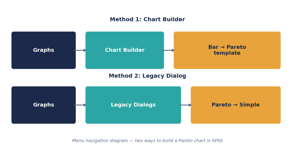
Method 1: Chart Builder
- Get your data in place: one categorical variable with counts, or raw case level records SPSS can tally itself.
- Optional, but worth doing: run Analyze > Descriptive Statistics > Frequencies first to confirm your category counts look right before you chart them.
- Open Graphs > Chart Builder.
- In the Gallery tab, click Bar, then drag the Pareto template onto the canvas.
- Drop your categorical variable onto the X axis.
- In Element Properties, set the statistic to Count or Percentage, whichever you want the bars labeled with.
- Click OK.
Method 2: Legacy Dialogs
- Go to Graphs > Legacy Dialogs > Pareto.
- Pick Simple, then choose “Counts or sums of variable” or “Values of individual cases,” depending on how your data is structured.
- Move your variable into Define bars by.
- Under Bars Represent, make sure Cumulative Line is checked. This is the step people skip most often, and without it you don’t have a Pareto chart.
- Click OK.
Both routes get you the same result. If you want to adjust colors, fonts, or axis labels afterward, double click the chart in the output viewer to open the Chart Editor.

That output above is close to what we hand back to clients: cleaned up, labeled, and ready to paste into a results chapter.
Reading the Output
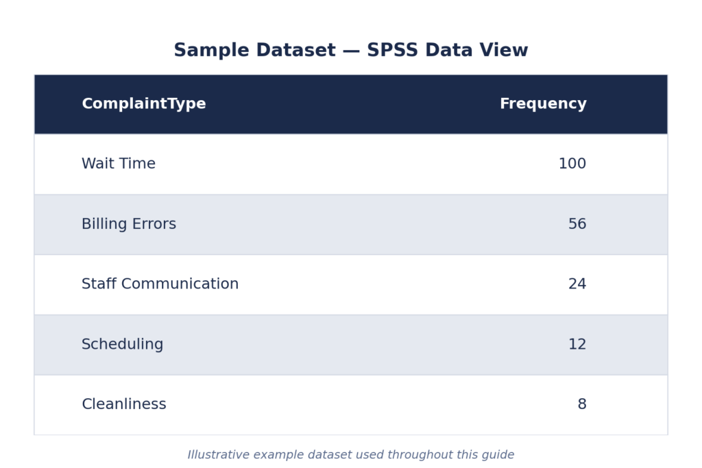
Using the same complaint dataset: wait time, billing errors, staff communication, scheduling, and cleanliness, 200 records total.
SPSS sorts the bars for you, largest to smallest, and the line climbs from left to right until it hits 100% at the final category. Here’s what to actually do with that:
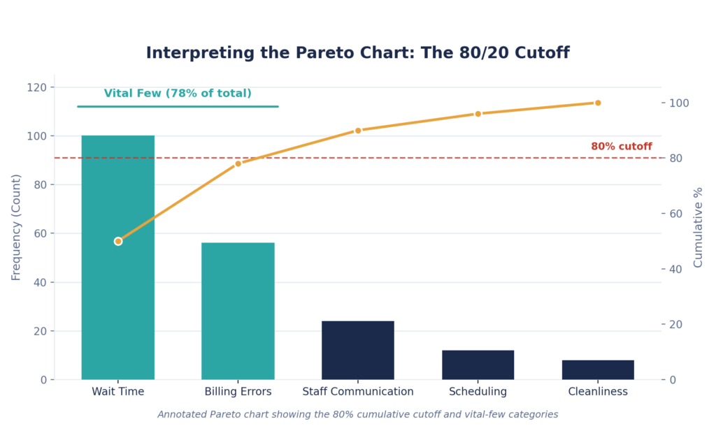
- Find where the line crosses roughly 80%. Everything to the left of that point is your “vital few,” the small set of categories doing most of the damage.
- In this dataset, wait time and billing errors alone account for 78% of complaints. That’s the finding worth writing about: two categories out of five explain almost four fifths of the problem.
- Write about the gap, not just the bars. Naming the tallest bar isn’t analysis. Showing how few categories carry most of the weight is.
Where Students Usually Lose Points
- No cumulative line. Without it, this is just a sorted bar chart wearing a Pareto chart’s name.
- Categories sorted wrong. Usually happens when the variable is formatted as a string instead of scale/count. Check the variable type if the order looks off.
- A chart with no interpretation attached. A screenshot doesn’t tell your reader what the 80/20 split means for your research question. You have to say it.
- Using it on the wrong kind of data. If what you actually have is a continuous variable binned into ranges, that’s a histogram, not a Pareto chart.
- Skipping APA formatting entirely. See below for what that actually looks like.
Running out of time before this section is due? Our statisticians build and interpret Pareto charts for dissertation clients regularly, formatted and ready to submit. See pricing →
Pareto Chart, Bar Chart, or Histogram?
Pareto Chart. Data type: Categorical. Cumulative line: Yes. Bar order: Always descending. Best for: Finding the causes that matter most. Common in: QI, Six Sigma, healthcare, operations research.
Bar Chart. Data type: Categorical. Cumulative line: No. Bar order: Optional. Best for: Comparing counts or group means. Common in: General comparisons.
Histogram. Data type: Continuous. Cumulative line: No. Bar order: By value range. Best for: Showing the shape of a distribution. Common in: Descriptive stats, normality checks.
More on the related tools: descriptive statistics in SPSS
Writing It Up in APA Format
- The chart is a Figure, not a table. Number it above the image; the descriptive title sits below it, for example, Figure 1. Pareto Chart of Patient Complaint Categories (N = 200).
- Refer to it by number in your text, and say what it means instead of leaving that to the reader: “As shown in Figure 1, wait time and billing errors accounted for 78% of all recorded complaints, indicating these two categories represent the primary drivers of patient dissatisfaction.”
- State the total N once, either in the caption or the sentence, not both.
- Name the SPSS version in your Methods section (e.g., “IBM SPSS Statistics version 29”).
Frequently Asked Questions
Yes. Graphs > Legacy Dialogs > Pareto, or build one manually through Graphs > Chart Builder using the Pareto template under Bar charts.
Check that “Cumulative Line” is selected under Bars Represent (Legacy Dialog), or that the option wasn’t unchecked in Chart Builder’s Element Properties.
Yes. Choose “Values of individual cases” and SPSS will tally frequencies per category automatically. You don’t need to pre-count anything.
No. A control chart tracks a process across time to catch variation. A Pareto chart ranks categories by frequency at a single point in time. Different question, different chart.
Five to ten is typical. Past 15, the chart gets hard to read and usually means the categories need to be grouped into broader buckets first.
Yes. Double click the chart in the output viewer to open the Chart Editor and adjust colors, labels, and fonts from there.
The cumulative line. That’s it. That’s the whole difference, and it’s also the part people forget.
If You’d Rather Not Do This Alone
Building the chart is the easy part. Interpreting it correctly, formatting it to APA standard, and being able to explain it if your committee asks, that’s usually where the real time goes.
Doing it on your own typically takes 3 to 6+ hours, more if something breaks, with higher error risk under deadline pressure, manual APA formatting, and revisions left to you. Working with us, most requests are delivered in as little as 24 hours, reviewed by statisticians before delivery, with APA formatting included and free revisions.
We’ve worked through this exact chart, and plenty like it, with over 500 dissertation and thesis clients: one on one, confidential, and with statisticians who use SPSS daily rather than a general tutoring service.
Get a free quote in 10 minutes →
Or take a look at our SPSS data analysis help and dissertation statistics consulting if you need support beyond this one chart.